")


")

In the dynamic world of design, color is a powerful tool that shapes emotions, captures attention, and communicates brand identity. As we step into 2025, the color trends influencing print design are a blend of bold innovation, earthy sophistication, and nostalgic charm. For businesses, designers, and individuals looking to make an impact with their posters, aligning with these trends can elevate your prints to new heights. At PrintPosters.in, we understand the importance of creating high-quality, visually striking posters that resonate with audiences. This comprehensive guide explores the hottest color trends for 2025, offering insights, practical tips, and inspiration to help you craft posters that stand out in any setting, from conferences to retail displays.
Why Colour Matters in Poster Design
Colour is more than a visual element; it’s a psychological trigger that influences how people perceive and interact with your design. According to research, 93% of consumers prioritize visual appeal when making purchasing decisions, and color plays a significant role in that appeal. In poster design, the right color palette can:
- Grab Attention: Bright and vibrant colors cut through visual clutter, making your poster noticeable in crowded environments like conferences or urban settings.
- Evoke Emotions: Colors like red can convey passion and urgency, while blues instill trust and calm.
- Reinforce Branding: Consistent use of brand-aligned colors strengthens recognition and loyalty.
- Ensure Readability: High-contrast color combinations improve legibility, crucial for posters viewed from a distance.
For print posters, the stakes are even higher. Unlike digital displays, printed colors must account for variations in lighting, material, and printing techniques to achieve the desired effect. At PrintPosters.in, we specialize in high-quality printing on materials like polyester fabric, satin, vinyl, and Star Flex, ensuring your colors pop with vibrancy and precision. Let’s dive into the top color trends for 2025 and how you can incorporate them into your poster designs.
Top Color Trends for 2025
The color trends for 2025 reflect a balance of modern sophistication, natural inspiration, and playful energy. Drawing from industry leaders like Pantone, WGSN, and design platforms like Design Shack, here are the key colors and palettes shaping the year, tailored for poster design.
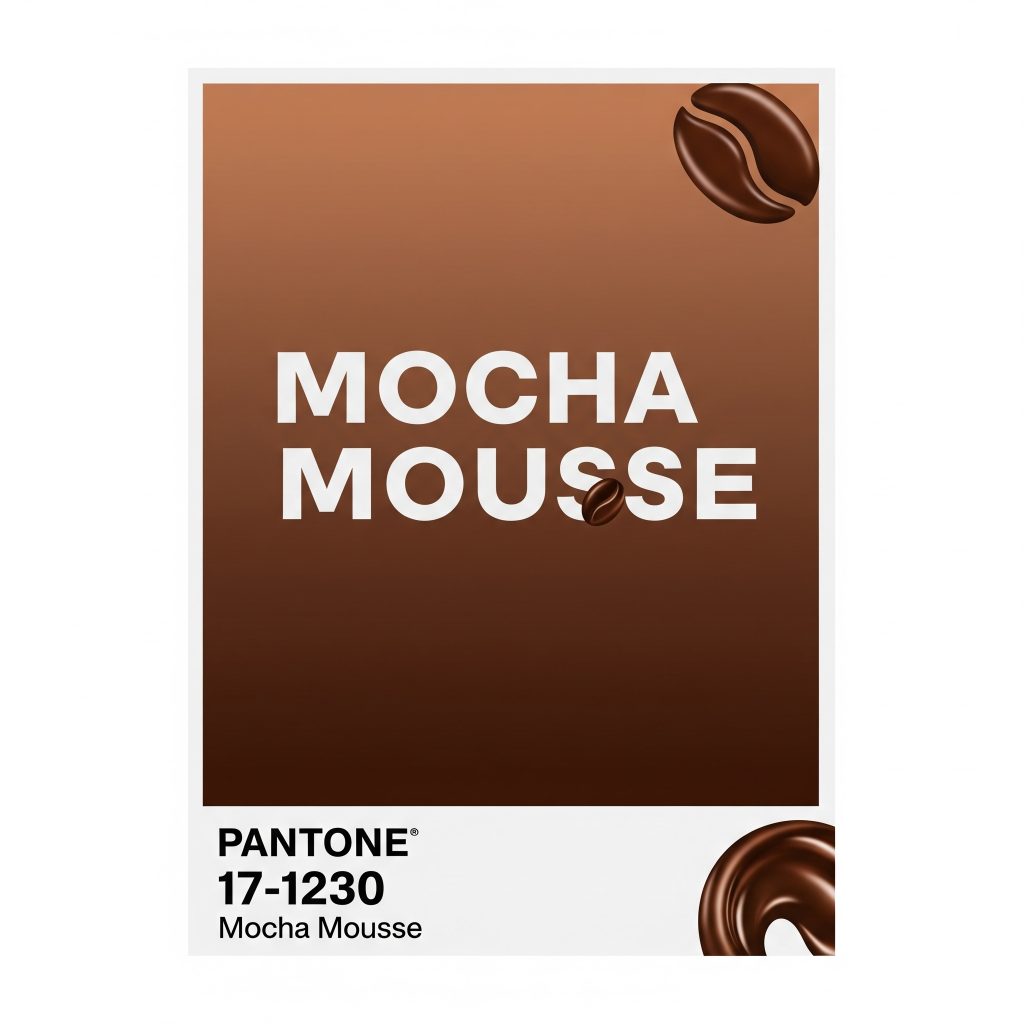
1. Mocha Mousse (PANTONE 17-1230)
Description: Pantone’s Color of the Year 2025, Mocha Mousse, is a rich, warming brown inspired by chocolate and coffee. This earthy, elegant hue exudes comfort and modern refinement, connecting viewers to nature while maintaining a sophisticated edge.
Why It Works for Posters:
- Versatility: Mocha Mousse pairs beautifully with both bold and neutral tones, making it ideal for diverse poster themes, from corporate branding to artistic displays.
- Emotional Appeal: Its warm, grounding quality evokes feelings of reliability and coziness, perfect for posters aiming to build trust or create a welcoming vibe.
- Print Compatibility: As a deep, saturated color, Mocha Mousse prints consistently across materials like satin and vinyl, avoiding the pitfalls of overly bright or neon colors that can be tricky to reproduce.
How to Use It:
- Background Color: Use Mocha Mousse as a backdrop for minimalist posters, paired with white or cream text for high contrast and readability.
- Accent Color: Highlight key elements like headlines or call-to-action buttons with Mocha Mousse against a neutral background like Glacier White.
- Pairings: Combine with soft pastels like Lavender Escape or metallic gold for a luxurious feel, or contrast with vibrant orange for a bold, attention-grabbing effect.
Example Application: For a scientific conference poster, use Mocha Mousse as the primary background color with white text for titles and gold accents for section headers. This creates a professional yet inviting aesthetic that stands out in a crowded poster session.
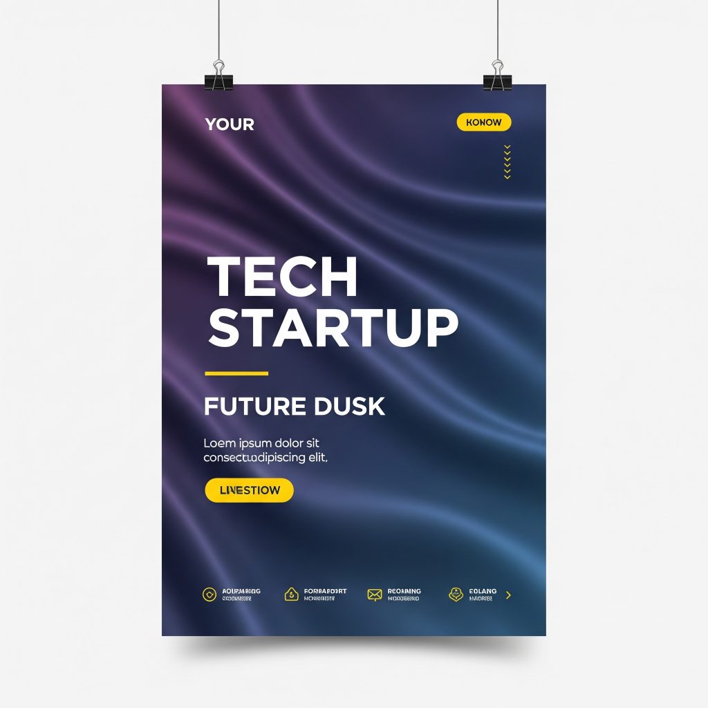
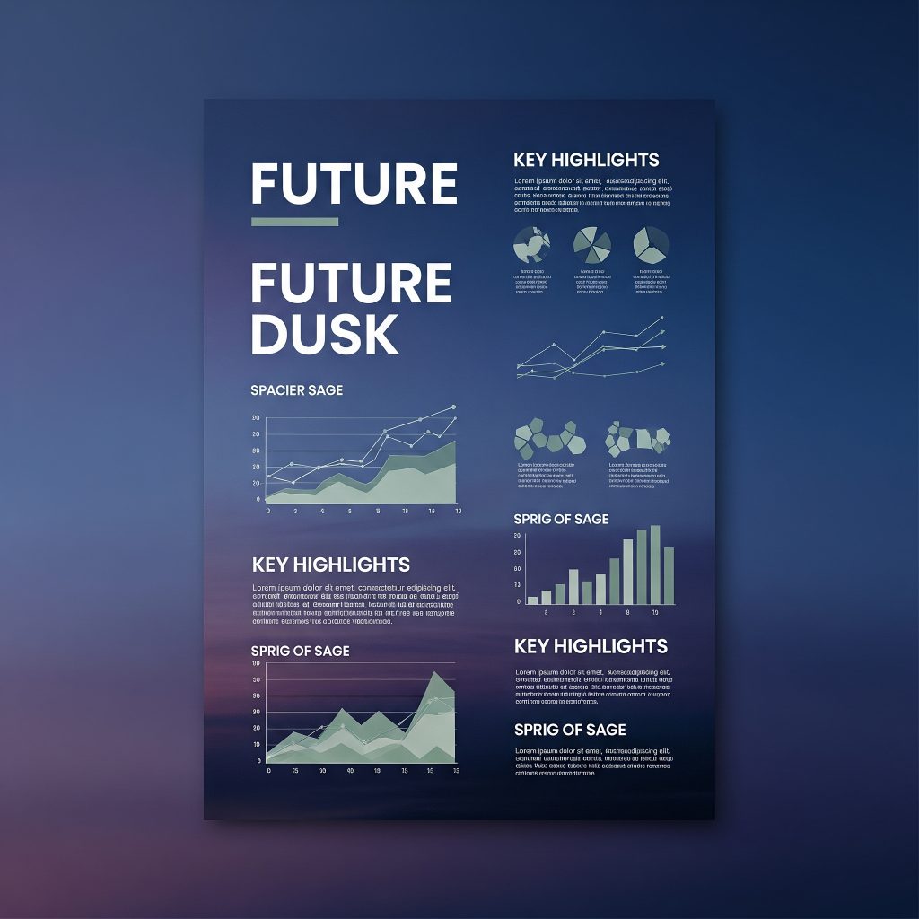
2. Future Dusk (WGSN and Coloro)
Description: Future Dusk, a moody blend of blue and purple, is WGSN and Coloro’s Color of the Year for 2025. This captivating hue balances calmness with a contemporary edge, making it ideal for modern, forward-thinking designs.
Why It Works for Posters:
- Sophisticated Appeal: Future Dusk conveys knowledge, trust, and innovation, making it perfect for tech, academic, or creative posters.
- Visual Impact: Its deep, rich tone stands out without being as aggressive as pure red or neon shades, ensuring it’s eye-catching yet professional.
- Flexibility: Works well in both digital and print formats, with consistent color reproduction on high-quality materials like Star Flex.
How to Use It:
- Primary Color: Use Future Dusk for large text or graphic elements to draw attention to key messages.
- Duotone Designs: Pair with a lighter shade like pale yellow or Glacier White for a duotone effect, creating a modern, edgy look.
- Accessibility: Ensure high contrast with light text to maintain readability, especially for posters viewed in varied lighting conditions.
Example Application: For a tech startup’s promotional poster, use Future Dusk as the base color with white text and subtle yellow accents for buttons or icons. Print on satin fabric for a sleek, polished finish that enhances the color’s richness.
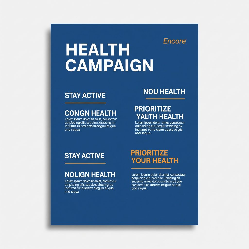
3. Encore (Ultramarine Blue)
Description: Encore, a rich ultramarine blue, is a standout color for 2025, offering an inviting charm and vibrant energy. It’s versatile enough for apparel, wall art, and posters, making it a go-to for bold designs.
Why It Works for Posters:
- Trust and Calm: Blue is universally associated with trust, security, and calmness, making it ideal for corporate, financial, or health-related posters.
- Print Reliability: Ultramarine blue prints vibrantly on materials like polyester fabric, ensuring sharp, consistent results.
- Versatility: Pairs well with both warm and cool tones, allowing for creative combinations.
How to Use It:
- Classic Combination: Pair Encore with white for a timeless, clean look that’s easy to print and highly readable.
- Bold Accents: Use with vibrant orange or Sunset Coral for a high-energy contrast that grabs attention.
- Minimalist Designs: Apply Encore sparingly in minimalist posters to highlight key elements like titles or logos.
Example Application: For a health campaign poster, use Encore as the background with white text and subtle orange accents for calls to action. Print on vinyl for durability in outdoor settings.
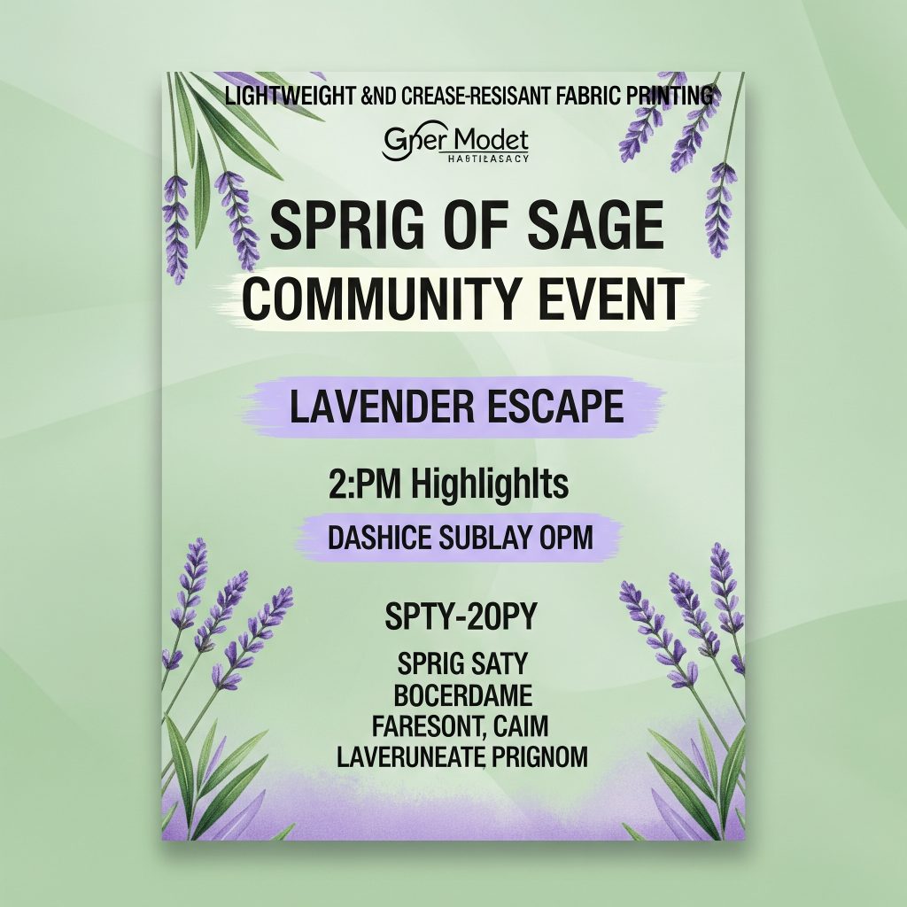
4. Soft Pastels: Lavender Escape and Sprig of Sage
Description: Soft pastels like Lavender Escape (a gentle lavender) and Sprig of Sage (a light, calming green) are trending for their soothing, nostalgic qualities, reminiscent of 80s and 90s aesthetics.
Why It Works for Posters:
- Calming Effect: These colors create a welcoming, approachable vibe, ideal for posters in educational or community settings.
- Trendy Appeal: Their retro charm aligns with 2025’s playful design trends, making them perfect for creative or lifestyle posters.
- Print Friendliness: Pastels print well on satin or fabric, offering a soft, elegant finish without overwhelming the viewer.
How to Use It:
- Background Layers: Use Lavender Escape or Sprig of Sage as soft backgrounds, paired with bold typography in black or Mocha Mousse.
- Accents: Highlight key elements like icons or borders with these pastels to add a touch of color without overpowering the design.
- Complementary Colors: Pair with neutral grays or Glacier White for a balanced, modern look.
Example Application: For a community event poster, use Sprig of Sage as the background with Lavender Escape accents for text highlights. Print on polyester fabric for a lightweight, crease-resistant display.
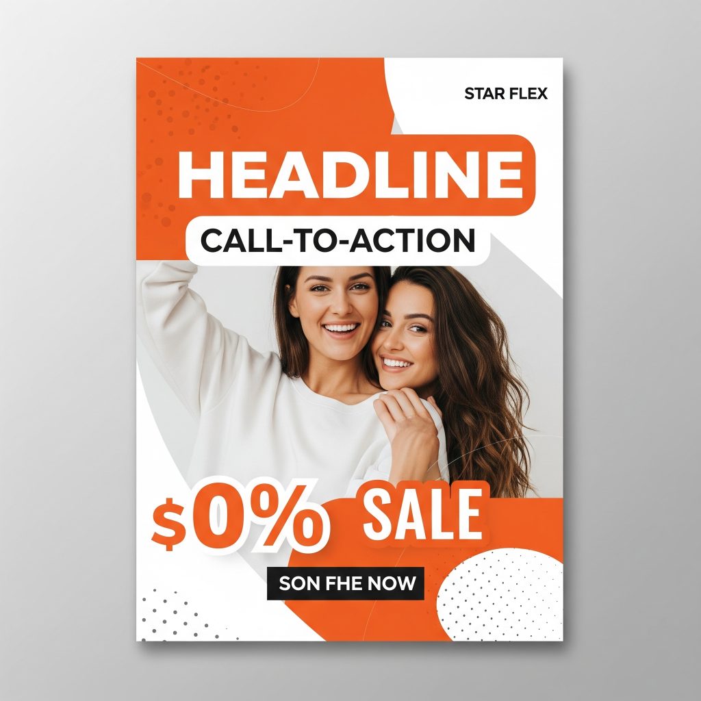
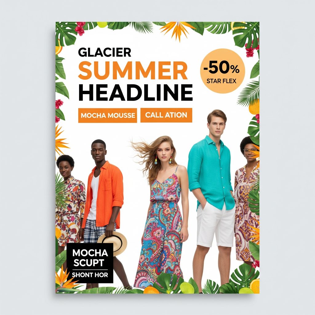
5. Bright Accents: Sunset Coral and Vibrant Orange
Description: Bright shades like Sunset Coral and vibrant orange inject energy and optimism into designs, making them ideal for posters that need to stand out.
Why It Works for Posters:
- Attention-Grabbing: These colors are highly visible from a distance, perfect for wildposting or promotional campaigns.
- Emotional Energy: Orange conveys warmth, excitement, and friendliness, while coral adds a playful, modern twist.
- Versatile Pairing: Works well with neutrals like Glacier White or bold hues like Encore for striking contrasts.
How to Use It:
- Call-to-Action Elements: Use Sunset Coral or vibrant orange for buttons, headlines, or promotional text to draw the viewer’s eye.
- Duotone Effects: Combine with black or Future Dusk for a bold, minimalist duotone design.
- Seasonal Appeal: These colors are especially effective for summer or festive campaigns due to their warm, vibrant energy.
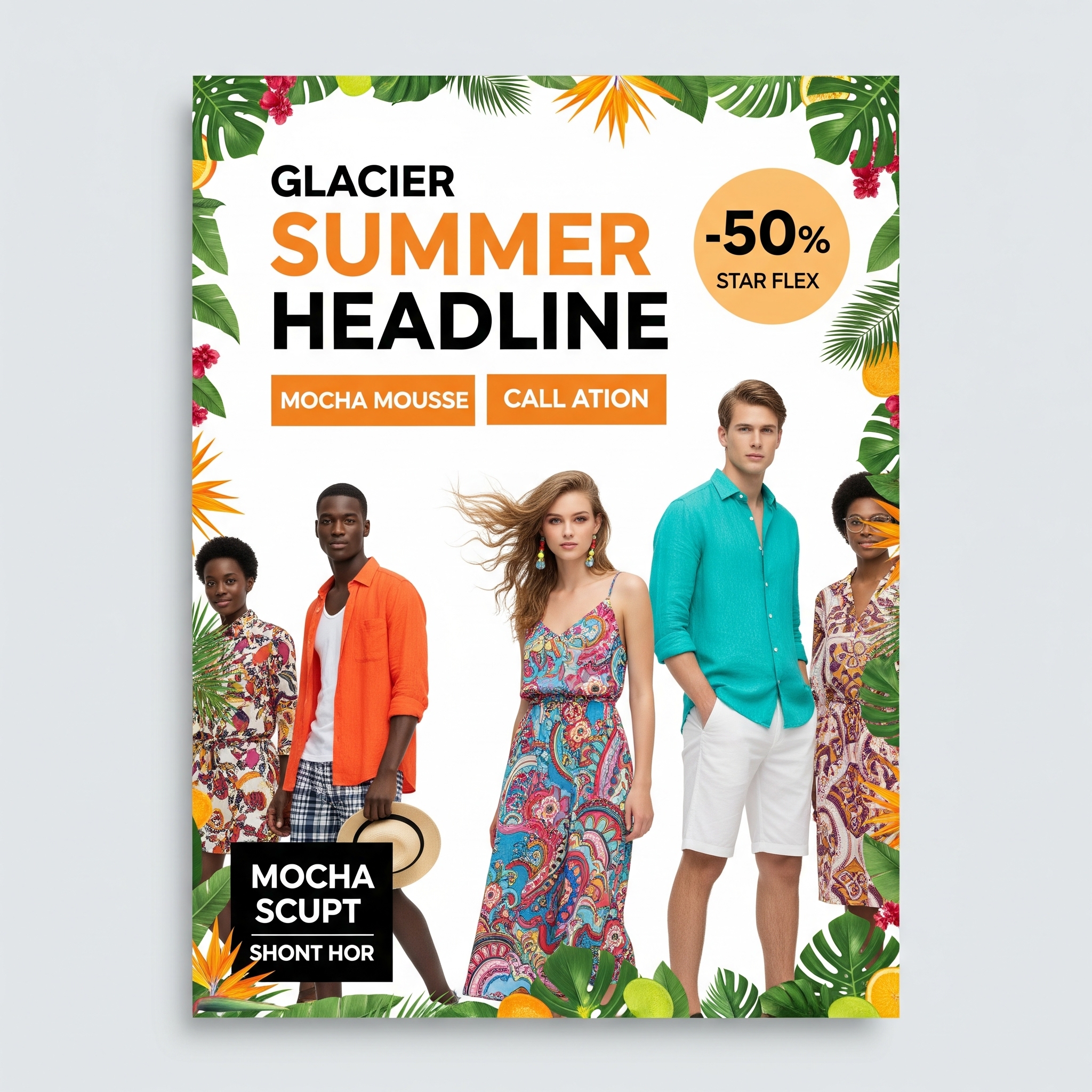
Example Application: For a retail sale poster, use vibrant orange for the headline and call-to-action text against a Glacier White background. Print on Star Flex for a durable, high-impact display.
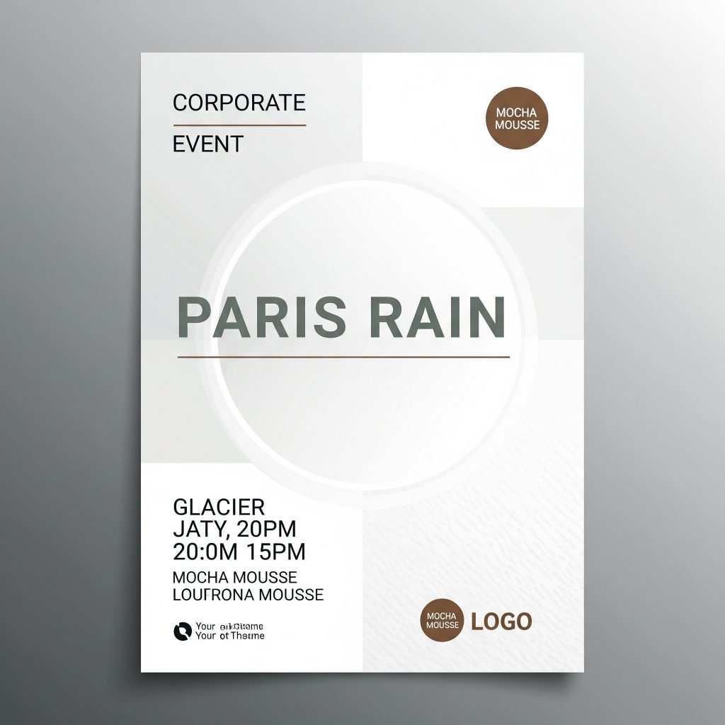
6. Neutral Tones: Glacier White and Paris Rain
Description: Glacier White (a creamy, light white) and Paris Rain (a muted gray-green) offer timeless appeal and versatility, serving as perfect backdrops or complementary tones.
Why It Works for Posters:
- Clarity and Simplicity: Glacier White provides a clean, crisp background that enhances readability and highlights other colors.
- Sophistication: Paris Rain adds a calming, modern touch, ideal for professional or minimalist designs.
- Print Consistency: Neutrals print reliably across all materials, avoiding color shifts common with brighter hues.
How to Use It:
- Background Base: Use Glacier White for a clean canvas, allowing bold colors like Encore or Mocha Mousse to pop.
- Subtle Accents: Apply Paris Rain for section dividers or subtle backgrounds in complex designs.
- Monochrome Palettes: Create a monotone look with varying shades of Paris Rain for an elegant, unified design.
Example Application: For a corporate event poster, use Glacier White as the background with Paris Rain for text and Mocha Mousse accents for logos. Print on satin for a luxurious finish.
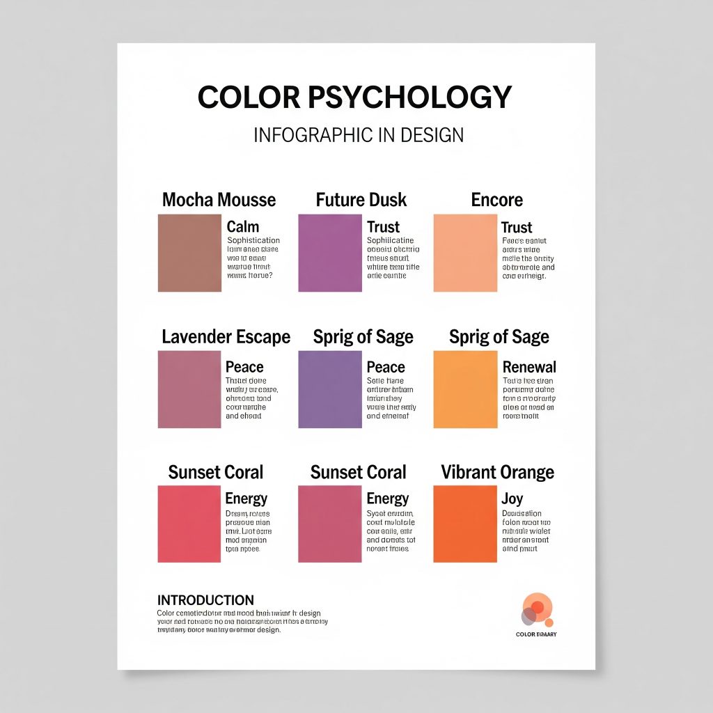
Color Psychology in Poster Design
Understanding the emotional impact of colors is crucial for effective poster design. Here’s how 2025’s trending colors align with psychological principles:
- Mocha Mousse: Evokes warmth, reliability, and comfort, making it ideal for brands aiming to build trust or convey authenticity.
- Future Dusk: Combines the calming trust of blue with the creative, luxurious feel of purple, perfect for innovative or academic posters.
- Encore: Instills trust, security, and professionalism, widely used in corporate and tech industries.
- Lavender Escape and Sprig of Sage: Promote relaxation and nostalgia, appealing to audiences seeking comfort or familiarity.
- Sunset Coral and Vibrant Orange: Convey energy, excitement, and optimism, driving action in promotional or sales-focused posters.
- Glacier White and Paris Rain: Symbolize purity, clarity, and sophistication, creating a neutral yet impactful base for any design.
By aligning your color choices with the emotions you want to evoke, you can create posters that resonate deeply with your target audience.
Practical Tips for Matching Colors to Print
Printing posters requires careful consideration to ensure colors look as intended. Here are key tips to achieve vibrant, accurate prints:
1. Use CMYK for Printing
- Why: Unlike RGB (used for digital displays), CMYK (Cyan, Magenta, Yellow, Black) is the standard color model for printing. RGB colors may appear vibrant on screen but can look dull or inaccurate when printed.
- How: Set your design software (e.g., Adobe Illustrator, Affinity Designer, or Inkscape) to CMYK mode before starting your poster. Check with your printing service, like PrintPosters.in, to confirm their preferred color profile.
2. Test Print for Accuracy
- **Why41⁊.
- How: Order a small-scale test print from PrintPosters.in to check color accuracy. This is cost-effective and allows you to adjust colors before committing to a full-size print.
3. Consider Material Impact
- Polyester Fabric: Lightweight and crease-resistant, ideal for vibrant colors like Encore or Sunset Coral.
- Satin: Enhances color richness, perfect for Mocha Mousse or Future Dusk for a polished look.
- Vinyl: Durable and suitable for bold colors like vibrant orange, ideal for outdoor posters.
- Star Flex: Offers high-impact printing for complex palettes, ensuring crisp colors across large formats.
4. Ensure Accessibility
- Color Blindness: Avoid relying solely on color to convey information. Use patterns or shading alongside colors like Future Dusk or Encore for charts and graphs.
- Contrast: Use high-contrast combinations (e.g., dark text on Glacier White or light text on Mocha Mousse) to ensure readability.
5. Limit Your Palette
- Why: Using 2-3 colors (primary, secondary, and accent) creates a cohesive, navigable design. Too many colors can overwhelm viewers �假期web:5⁊.
- Example: Combine Mocha Mousse (primary), Glacier White (secondary), and Sunset Coral (accent) for a balanced, eye-catching poster.
Designing with 2025 Trends: Step-by-Step Guide
Step 1: Define Your Poster’s Purpose
- Objective: Is your poster for a scientific conference, a retail promotion, or a community event? The purpose influences your color choices.
- Example: For a scientific poster, use Future Dusk and Glacier White for a professional, trustworthy look. For a sale poster, opt for vibrant orange and Mocha Mousse to drive urgency.
Step 2: Choose Your Palette
- Select 2-3 colors from the 2025 trends based on your audience and message. Use tools like Coolors.co to experiment with combinations.
- Example Palette: Mocha Mousse, Lavender Escape, and Glacier White for a calming, elegant design.
Step 3: Design in CMYK
- Set your design software to CMYK mode to ensure color accuracy. Avoid overly saturated colors like neon or metallic shades, which can be challenging to print accurately.
Step 4: Test Your Design
- Create a digital mockup and review it on different screens to check color consistency. Order a test print from PrintPosters.in to verify the final output.
Step 5: Select the Right Material
- Choose a material that enhances your colors. For example, satin for rich hues like Future Dusk, or vinyl for bold colors like Sunset Coral in outdoor settings.
Step 6: Print with PrintPosters.in
- Upload your design to PrintPosters.in for high-quality printing starting at just ₹150. Our advanced printing technology ensures vibrant colors and sharp details, tailored to your chosen material.
Case Studies: 2025 Color Trends in Action
Case Study 1: Scientific Conference Poster
- Objective: Present research findings at an academic conference.
- Palette: Future Dusk (primary), Glacier White (secondary), Sprig of Sage (accent).
- Design: Use Future Dusk for the background, Glacier White for text, and Sprig of Sage for charts and highlights. This creates a professional, approachable look.
- Material: Polyester fabric for easy transport and vibrant color reproduction.
- Result: The poster stands out in a crowded session, with clear text and a modern aesthetic that invites discussion.
Case Study 2: Retail Promotion Poster
- Objective: Advertise a summer sale for a fashion brand.
- Palette: Vibrant orange (primary), Mocha Mousse (secondary), Glacier White (accent).
- Design: Use vibrant orange for headlines and call-to-action buttons, Mocha Mousse for secondary text, and Glacier White as the background. This creates a high-energy, eye-catching design.
- Material: Star Flex for durability and bold color impact in a retail environment.
- Result: The poster drives foot traffic with its bold, optimistic colors and clear messaging.
Case Study 3: Community Event Poster
- Objective: Promote a local art festival.
- Palette: Lavender Escape (primary), Paris Rain (secondary), Sunset Coral (accent).
- Design: Use Lavender Escape for the background, Paris Rain for text, and Sunset Coral for event details and icons. This creates a welcoming, creative vibe.
- Material: Satin for a luxurious, artistic finish.
- Result: The poster attracts a diverse audience with its soft, nostalgic colors and elegant presentation.
The color trends of 2025 offer a rich palette for creating impactful, memorable posters. From the earthy elegance of Mocha Mousse to the vibrant energy of Sunset Coral, these colors allow you to craft designs that resonate with your audience and align with modern aesthetics. By understanding color psychology, choosing the right materials, and following best practices for printing, you can ensure your posters not only look stunning but also achieve your communication goals.
At PrintPosters.in, we’re committed to bringing your vision to life with high-quality printing that captures the vibrancy of 2025’s hottest colors. Whether you’re designing for a conference, promotion, or event, our range of materials—polyester fabric, satin, vinyl, and Star Flex—ensures your posters are durable, professional, and visually striking. Start designing today, and let the colors of 2025 elevate your prints to the next level.
Call to Action: Ready to create your 2025 poster? Visit PrintPosters.in to upload your design and explore our printing options starting at just ₹150. Let’s make your posters pop with the hottest colors of the year!
Your Walls, Your Story: Matching Your Prints to 2025’s Hottest Colors
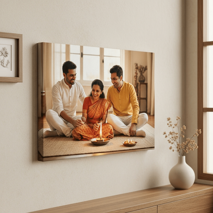
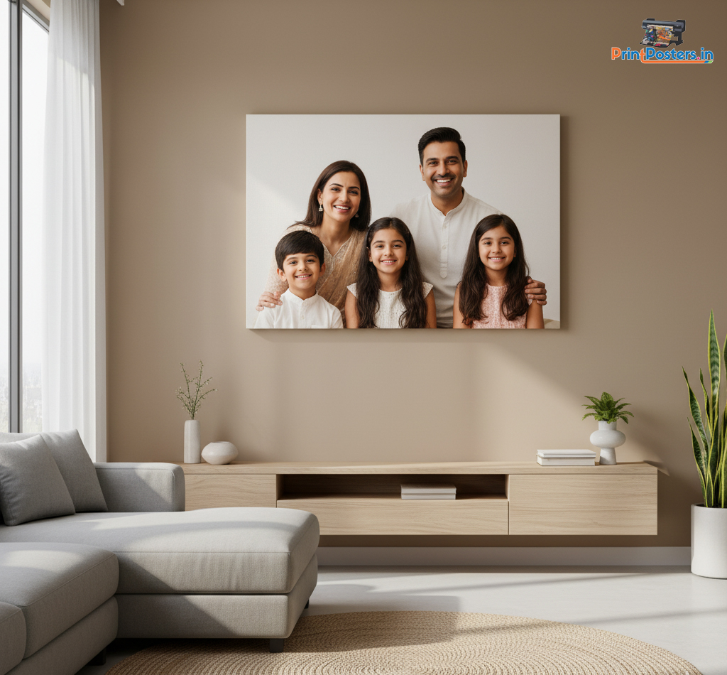
Your home is more than just a place to live; it’s a canvas for your personality. And one of the most impactful ways to express your style is through wall art. The right poster or canvas print doesn’t just fill a space—it transforms it, sets a mood, and tells your story. As we look ahead to 2025, interior design is embracing colors that are rich, personal, and deeply connected to the natural world.
At PrintPosters.in, we believe that everyone can be their own interior designer. To help you create a space that feels both modern and uniquely you, we’ve put together this guide on 2025’s hottest color trends and how to choose the perfect prints to match.
The 2025 Color Palette: Warmth, Nature, and Bold Expression
This year, interior design is moving away from cool, stark neutrals and embracing palettes that feel warm, inviting, and full of life. Here are the key colors making a splash:
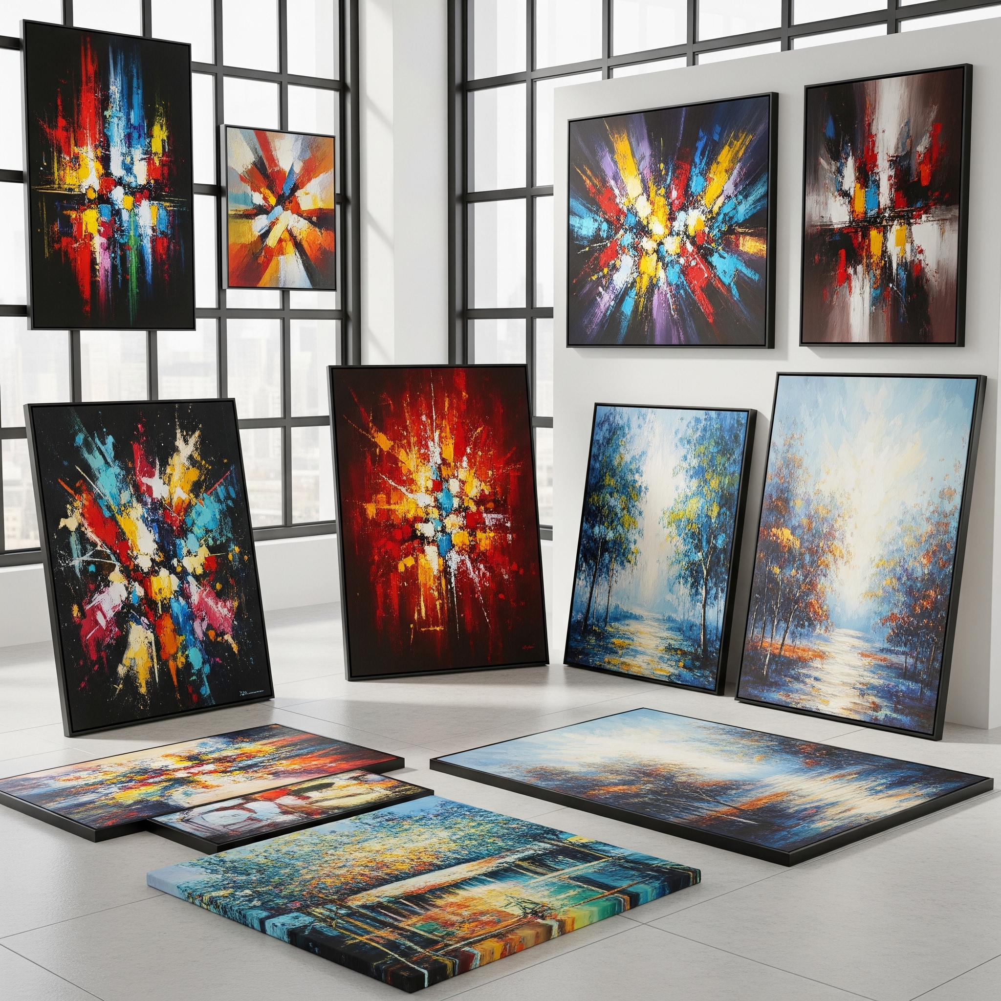
- Rich and Earthy Tones: Think of a warm, sun-drenched landscape. Colors like olive green, deep eggplant, burnt red, and warm ochre are taking center stage. These shades create a cozy, enveloping atmosphere that feels both sophisticated and comforting.
- The Full Spectrum of Nature: The love for nature-inspired hues continues, expanding to include every shade of green and blue imaginable. From moody emerald and midnight blue to calming sage green and airy light blue, these colors bring the tranquility of the outdoors inside.
- The “Color Drenching” Trend: For the bold at heart, “color drenching” is a major trend. This involves painting the walls, trim, and even the ceiling of a room in the same saturated color, creating a dramatic, jewel-box effect.
How to Choose the Perfect Print for Your Space
Now for the fun part: choosing art that complements these gorgeous new palettes. Whether you’re printing a cherished family photo or a piece of abstract art, here’s how to make it work.
1. For Rooms with Warm, Earthy Tones: To enhance the cozy vibe of a room painted in ochre, olive, or burnt red, look for prints that harmonize with these colors.
- What to Print: Consider landscape photos with golden hour light, black-and-white portraits that add a timeless touch, or abstract art with warm, earthy swirls of color. Vintage-inspired prints also work beautifully with this palette.
- The Effect: This creates a layered, cohesive look that makes a room feel like a warm and inviting sanctuary.
2. For Nature-Inspired Green and Blue Spaces: A room painted in green or blue is already calm and serene. Your choice of art can either amplify this feeling or add a pop of energy.
- What to Print: Botanical and floral prints are a natural fit, enhancing the connection to the outdoors. For a bold statement against a dark emerald or navy wall, choose a print with a bright, contrasting color or a striking monochromatic design. In a room with softer sage or light blue walls, prints with gentle, organic shapes will maintain the peaceful atmosphere.
- The Effect: You can create a space that feels like a calming retreat or a vibrant, nature-inspired oasis.
3. For a Bold, Color-Drenched Room: When your walls do all the talking, your art can play a supporting role or join the conversation.
- What to Print: To make a powerful statement, choose a print with bold typography—like an inspiring quote or a meaningful word. For a more subtle approach, a print in a monochromatic palette (shades of the same color as the wall) can add depth and texture without competing for attention. Alternatively, a simple black and white photo in a clean frame can provide a sophisticated visual break.
- The Effect: This approach allows you to add a layer of personality that is either dramatic and eye-catching or elegantly understated.
A Style That’s All Your Own
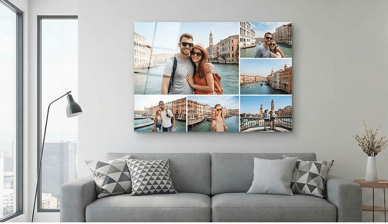
Remember, these trends are just a starting point. The most important trend for 2025 is personalization. Your home should reflect your unique story. Don’t be afraid to mix and match styles. Create an eclectic gallery wall that combines your personal photos with abstract prints, different frame sizes, and even textured art.
At PrintPosters.in, we’re here to help you bring your vision to life. With our wide range of high-quality Canvas Prints, Poster Prints, and Framed Photos available in custom sizes, you have everything you need to turn your favorite digital memories into tangible art that perfectly suits your space.
Ready to refresh your walls? Explore our collection and start creating today!