To effectively showcase products on a standee, it is important to consider several key factors that can have a significant impact on the success of the display. Here are some do’s and don’ts to keep in mind:
Do’s:
- Keep it simple: The standee should have a straightforward, clutter-free design as well as clear, concise messaging that the target audience can easily understand.
- Focus on pictures: Using high-quality pictures of the product can be a good way to get people’s attention and get them interested in the display.
- Highlight benefits: Emphasizing the key benefits and unique features of the product can help to differentiate it from competitors and convince customers to make a purchase.
- Ensure visibility: Make sure that the standee is placed in a high-traffic area where it can be easily seen by potential customers.
- Use branding. Using the brand’s logo and colour scheme is a good way to get people to know and like the brand.
- Consider the size: Choose a size that is appropriate for the space and the product being showcased. A larger standee may be more visible, but it should not be so large that it becomes difficult to move or transport.
- Incorporate a call to action: Including a call to action, such as “Buy now” or “Learn more,” can encourage customers to take action and engage with the product.
- Utilize different types of stands: Depending on the product and the space available, different types of stands can be used, such as tabletop stands, floor stands, or wall-mounted stands.
- Keep it consistent: Ensure that the standee’s messaging and design are consistent with other marketing materials, such as product packaging, flyers, or website design.
- Test and iterate: experiment with different designs and messaging and monitor the stand’s effectiveness. Make adjustments as needed to optimize its impact.
Don’ts:
- Overload with information: Don’t put too much information on the standee. This can make it hard for customers to understand the main message.
- Don’t pay attention to design: A standee that isn’t well made can look bad and fail to attract customers.
- Forget about the target audience: It is important to consider the preferences and needs of the target audience when designing the standee, as this will help to ensure that it resonates with them.
- Ignore lighting: Lighting has a big effect on how people see the product, so it’s important to make sure the standee is well-lit and the product is shown in the best way possible.
- Neglecting placement: Placing the standee in an area where it is not easily visible or accessible can limit its effectiveness and reduce its impact on potential customers.
- Use too many colours: Using too many colours can make the standee look busy and distract from the main message. Stick to a few key colours that are consistent with the brand’s colour scheme.
- Neglect the product’s packaging: The packaging of the product should complement the standee’s design and help to reinforce the product’s messaging.
- Use low-quality images: Low-quality images can make the product look unappealing and unprofessional. Ensure that the images are high-resolution and of good quality.
- Forget about the competition: Consider what other products or companies are in the same space and ensure that the standee stands out and differentiates itself from the competition.
- Ignore the target audience’s needs: Understanding the target audience’s needs and preferences is critical in creating an effective standee. Consider factors such as age, gender, and lifestyle when designing the standee.
Overall, by keeping these do’s and don’ts in mind, businesses can create effective and impactful standees that effectively showcase their products and help to drive sales.
Standee Printing: Command Attention, Dominate Promotions – High-Impact Displays That Deliver Results, Exclusively from PrintPosters.in
Tired of your marketing messages getting lost in the noise? Ready to make a real impact at your next event or promotion? Standee printing is the secret weapon you need to instantly capture attention, command visibility, and drive results. These dynamic, self-standing promotional displays are the ultimate solution for advertising, branding, and event promotions. Imagine your message – bold, vibrant, and impossible to ignore – grabbing attention in high-traffic areas like retail stores, bustling trade shows, crowded malls, key conferences, and busy offices. Standee printing from PrintPosters.in is your portable, cost-effective powerhouse for making a lasting impression.
Unlock the Power of Standee Printing: Benefits That Drive Business
Don’t settle for marketing that blends in. Standee printing offers a powerful suite of advantages that will transform your promotional efforts:
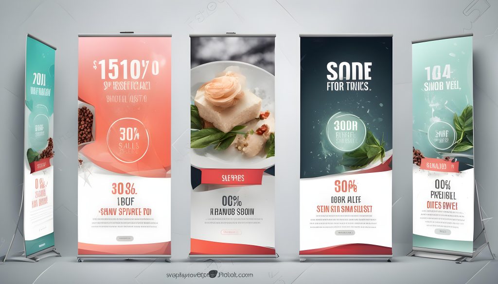
- Unleash Eye-Catching Visual Domination: Demand Attention in Any Crowd. Standees are designed for maximum visual impact. High-resolution graphics explode with vibrant color and razor-sharp detail, guaranteeing your message instantly stands out, cutting through the clutter of even the most crowded spaces. Stop hoping to be seen – start commanding attention.
- Portability & Featherlight Freedom: Marketing on the Move, Effortlessly. Forget cumbersome setups and logistical headaches. Standees are engineered for ultimate portability and featherlight ease. Transporting and setting them up is a breeze – no tools, no fuss. Place them anywhere, indoors or out, and adapt your marketing to any location with effortless flexibility. Your message, mobile and ready to make an impact.
- Cost-Effective Advertising That Delivers ROI: Maximize Your Marketing Budget. Stop pouring money into expensive permanent signage or fleeting digital ads. Standees offer a remarkably budget-friendly marketing solution that provides long-term value. Invest smartly in durable, reusable standees and maximize your return on investment. Get powerful advertising without breaking the bank.
- Limitless Customizable Designs: Brand it Your Way, Make it Unforgettable. Your brand is unique – your standee should be too. Standees are fully customizable, empowering you to showcase your logo, dominate with brand colors, highlight key product information, or promote specific event details – all perfectly tailored to your exact marketing needs. Create standees that are undeniably yours and leave a lasting brand impression.
- Reusable & Built to Last: Sustainable Marketing That Pays Off. Stop throwing money away on disposable promotions. High-quality standees crafted from premium PVC, durable vinyl, or long-lasting fabric are built to endure, ready for reuse at multiple events. Make a smart, sustainable marketing investment that delivers value event after event.
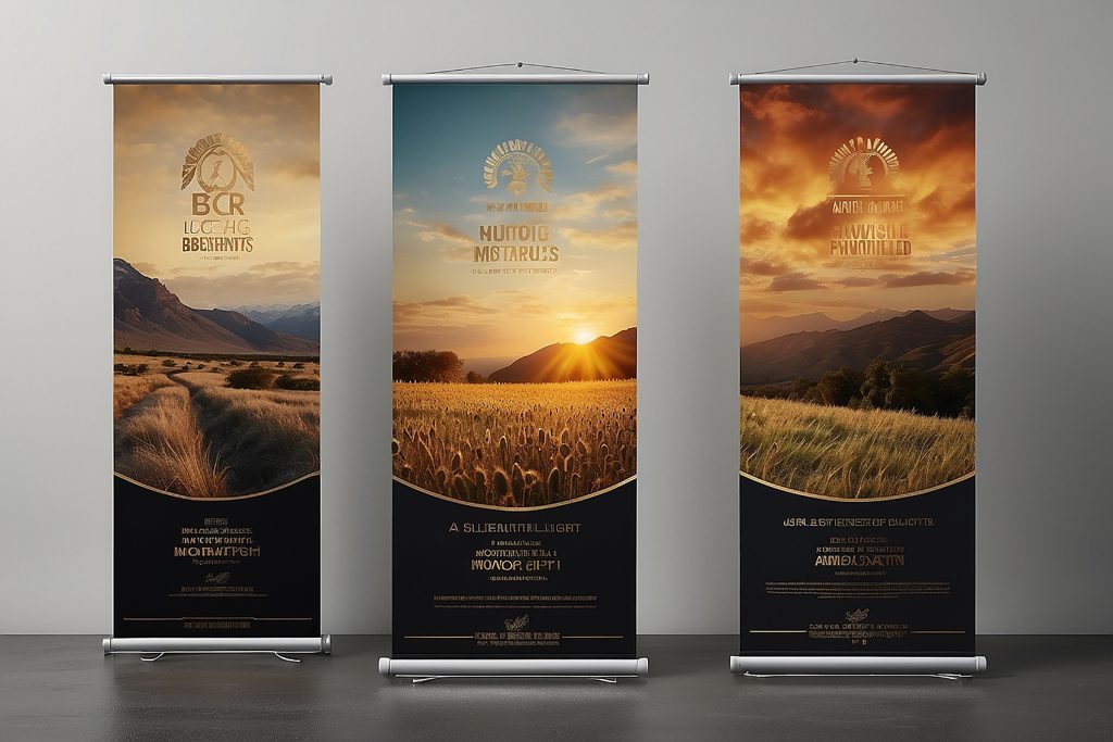
Explore the Diverse World of Standees at PrintPosters.in: Find Your Perfect Fit
PrintPosters.in offers a comprehensive range of standee types, each engineered for specific promotional needs and aesthetic preferences:
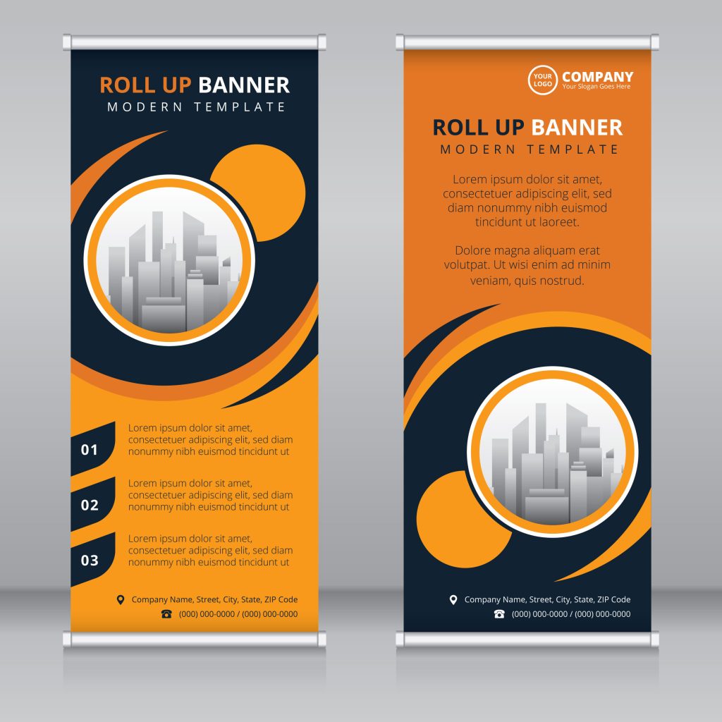
- Roll-Up / Retractable Standees: Instant Setup, Effortless Elegance, Professional Impact. Experience unparalleled convenience and professional polish with our Roll-Up/Retractable Standees. Featuring a smooth retractable mechanism, setup and storage are instantaneous and effortless. Available in industry-standard sizes like 2×5 feet, 3×6 feet, and more, these standees are the gold standard for trade shows, high-profile corporate events, and sophisticated promotional campaigns. Project professionalism and make setup a breeze.
- L-Banner & X-Banner Standees: Budget-Smart, Lightweight, and Ready to Promote. Maximize your marketing budget without compromising impact with economical and highly effective L-Banner & X-Banner Standees. Utilizing lightweight L-shaped or X-shaped stands, these standees offer a cost-conscious solution that’s ideal for short-term promotions, retail storefronts, and budget-minded marketing initiatives. Get your message out there powerfully and affordably.
- Foam Board & Sunboard Standees: Sturdy, Freestanding, and Visually Striking for Indoor Events. Command attention with robust and freestanding Foam Board & Sunboard Standees. Expertly crafted from durable 5mm or substantial 10mm sunboard, these standees offer exceptional stability and visual presence. Best suited for high-impact indoor events, product launches, impressive exhibitions, and creating a solid, professional impression. Make a statement that stands firm.
- LED-Backlit Standees: Illuminate Your Message, Captivate Day & Night. Break through visual barriers and maximize visibility, even in low-light environments, with cutting-edge LED-Backlit Standees. Featuring integrated LED lighting, these standees deliver extraordinary visibility, making them irresistible for night events, dazzling concerts, attention-grabbing premium promotions, and any setting where illumination is key. Light up your message and outshine the competition, day or night.
- Fabric Standees: Sleek, Premium, Washable, & Uniquely Reusable. Experience the pinnacle of style and sustainability with luxurious Fabric Standees. Crafted from premium, wrinkle-free fabric stretched taut over a durable metal frame, these standees offer a sleek, undeniably premium look and feel. Washable and exceptionally reusable, Fabric Standees are the sophisticated and eco-conscious choice for businesses that demand both style and sustainability. Elevate your brand with reusable elegance.

Where Will You Deploy Your Standees? – Strategic Placement for Maximum Reach
Standees are incredibly versatile and can be strategically placed to maximize impact in a wide array of locations:
- Dominate Business & Retail Outlets: Showcase irresistible new arrivals, highlight limited-time offers and discounts, and powerfully amplify brand awareness campaigns directly at the point of purchase, driving sales and customer engagement.
- Command Corporate Events & Conferences: Visually communicate company achievements, showcase your groundbreaking products or services, and guide attendees seamlessly with clear, professional informational signage. Enhance your corporate presence and make your message unforgettable at every event.
- Maximize Trade Show & Exhibition Presence: Transform your booth into a magnet for attendees. Effectively promote your product demos, convey your key messages with impact, and stand out from the competition at busy trade shows and exhibitions, driving traffic and generating leads.
- Elevate Educational Institutions: Showcase compelling academic programs, provide essential admissions information to prospective students, and celebrate noteworthy achievements. Guide students effortlessly during events and orientations, creating a welcoming and informative atmosphere.
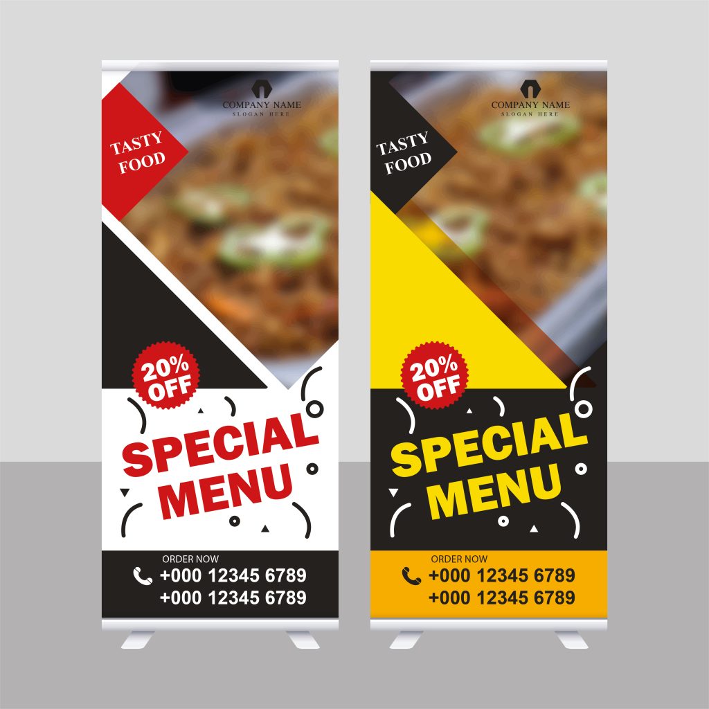
- Captivate Hotels, Restaurants & Cinemas: Entice customers with mouthwatering menu specials, clearly display event schedules, or promote eagerly awaited upcoming movie releases. Enhance the customer experience and drive sales directly at your venue.

PrintPosters.in: Your Standee Printing Powerhouse – Experience Unmatched Quality & Service
Why choose PrintPosters.in for your standee printing needs? We are the industry leaders, committed to delivering standees that exceed expectations in quality, durability, and impact:
- ✅ Uncompromising Premium Printing Quality: Vibrant Colors, Razor-Sharp Detail Guaranteed. We utilize state-of-the-art high-resolution printing technology on your choice of glossy or matte vinyl, robust sunboard, or luxurious fabric to ensure your standees explode with vibrant, eye-catching colors and incredibly sharp, detailed graphics. Demand the best – PrintPosters.in delivers.
- ✅ Engineered for Durability & Long-Lasting Impact: Standees Built to Endure. Invest in marketing that lasts. Our standees are expertly printed on tear-resistant, waterproof, and fade-proof materials, guaranteeing exceptional long-term usability and enduring visual impact, event after event. Maximize your investment with standees built to last.
- ✅ Limitless Size Options: Tailored to Your Exact Vision & Space. No cookie-cutter solutions here. Choose from our extensive range of standard sizes, or unlock complete customization and request a custom size perfectly tailored to your unique promotional needs and spatial requirements. We create standees that fit your vision, perfectly.
- ✅ Unbeatable Bulk Order Discounts: Maximize Your Budget, Multiply Your Impact. Planning a large-scale event or extensive promotional campaign? Take advantage of our exclusive bulk pricing and unlock significant cost savings when ordering multiple standees. Amplify your marketing reach without exceeding your budget.
- ✅ Lightning-Fast & Hassle-Free Delivery Across India: On-Time, Every Time. Deadlines matter. We guarantee quick and hassle-free doorstep delivery across India, ensuring your standees arrive on time, every time, ready to make a powerful impact at your crucial event or promotion. Reliability you can count on, delivered directly to you.
Order Your Custom Standees Today – Command Visibility & Drive Unprecedented Results!
Don’t let your brand blend into the background any longer. Give your brand the unmissable visibility it deserves with high-quality standee printing from the industry experts – PrintPosters.in. Standees are not just displays; they are powerful marketing assets that drive brand recognition, customer engagement, and ultimately, business success.
Browse our extensive standee options and unleash your creativity! Customize your standee today at PrintPosters.in and prepare to command attention, dominate your promotions, and witness the unprecedented results that follow! Your brand’s visibility revolution starts now. 🚀


