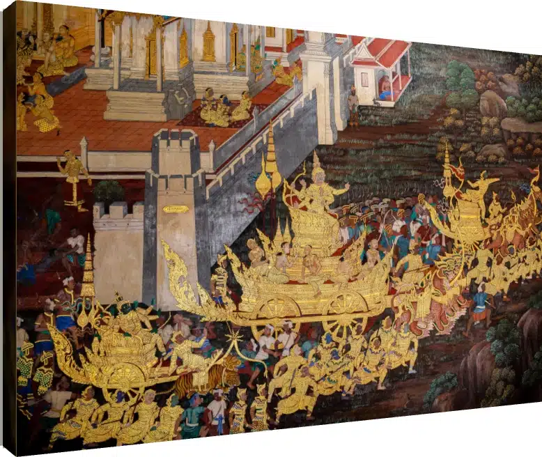









The same abstract painting can be the best thing in a living room and completely wrong in a bedroom. Not because of taste, but because rooms ask different things of their walls. A living room wants an anchor — something the furniture arranges itself around. A bedroom wants the opposite: something that does not demand attention from someone lying down and trying to stop thinking. An office wants structure. An entryway has about three seconds to make an impression and almost no distance to do it from.
This guide goes room by room: what works, what to avoid, which colour families and finishes suit each space, and the practical constraints — glare, moisture, rental walls — that decide more purchases than aesthetics do. If you want the broader method first, our companion piece covers how to choose abstract wall art, including the four print finishes and how to size a piece.

Living room: the anchor piece
This is the one room where you should buy the biggest, boldest piece you are comfortable with. A living room is viewed from four or five metres away, and at that distance a small painting simply stops registering. It is also the room most likely to have a genuinely blank wall above a sofa, which is the easiest wall in any home to get right.
- What works: warm, saturated palettes — gold, crimson, ochre, deep blue. Figurative abstracts with metallic accents. Large fluid pours. Anything with a strong focal area rather than an even all-over texture.
- Scale: roughly two-thirds the width of the sofa, with a hand’s width of gap above the sofa back. If you are between sizes here, always go up.
- Finish: a floater frame if you want it to read as a collected artwork; gallery wrap if the room is bright, since canvas has effectively no glare.
- What to avoid: a busy abstract in a room that already has patterned upholstery, patterned curtains and a rug. At that point the wall is the only place left for the eye to rest.
One thing worth saying plainly: in a living room, scale beats finish. If your budget forces a choice between a large gallery wrap and a small floater-framed piece, the large one will do more for the room every single time. Finish rewards close inspection, and nobody inspects a living-room wall closely.
Bedroom: calm over drama
Bedrooms are where people most often buy the wrong abstract, and the reason is that they shop in the same mood they shop for a living room. A piece that is striking at 11am on a white website background is a piece you have to look at every night and every morning.
- What works: soft washes, pastel liquid flows, watercolour abstracts, blue and muted green palettes. Low internal contrast — the colours should sit close together in tone rather than fighting.
- Use the Calming filter. This is exactly the case it exists for, and filtering first stops you talking yourself into something high-contrast.
- Scale: two-thirds the headboard width, centred above the bed.
- What to avoid: high-contrast black-and-bright-orange work, hard geometric shapes, and anything with a face looking directly out of the frame. Figurative abstracts are better placed where you walk past them than where you sleep under them.
A second consideration specific to bedrooms: if the piece hangs opposite a window, a glossy acrylic finish will reflect the window every morning. Canvas is the safer choice here for a practical reason rather than an aesthetic one.
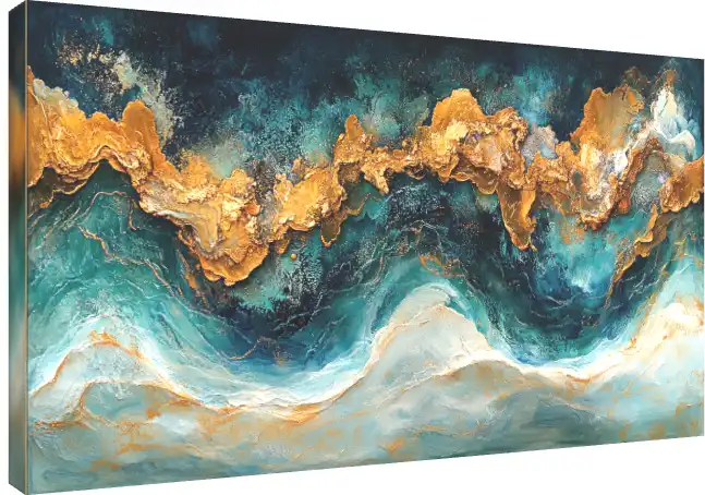
Home office and study: structure, and what sits behind you
Working from home gave this room a second job. The wall behind your desk is now a backdrop that colleagues and clients look at for hours a week, and that changes what belongs on it.
- What works: geometric abstracts, structured compositions, restrained palettes. Geometric work holds its shape at smaller sizes better than painterly work, which matters in a room where you sit close to the walls.
- For video calls: one mid-sized piece behind you, slightly off-centre, in a colour that contrasts with your clothing. Avoid anything with fine detail or heavy texture — webcam compression turns both into noise.
- Avoid high-gloss behind a desk. An acrylic print will catch your monitor and your ring light. This is the single most common mistake in a home-office setup.
- Scale: smaller than you would choose for a living room. You view this wall from a metre or two, so a large piece becomes overwhelming rather than impressive.
The gallery’s Office Decor filter is a reasonable starting point here, and it is worth using with the Minimal mood filter alongside it — the combination tends to surface work that reads as considered rather than decorative, which is usually what a workspace wants.
Entryway and hallway: three seconds, no distance
Entryways are the most constrained walls in most Indian homes and the most rewarding to get right, because they set the tone for everything behind them. The constraint is viewing distance: you see a hallway piece from a metre away and at an angle, never straight on from across a room.
- Portrait orientation beats landscape. Hallways are tall and narrow; a vertical piece fits the proportions of the wall and of how you move past it.
- This is where finish earns its money. At a metre, you can actually see the canvas weave, the float gap, the gloss. A floater frame or an acrylic print is worth the premium here in a way it is not in a living room.
- Go smaller than feels right. A piece sized for an open wall will crowd a corridor. Something in the Small to Medium range usually works harder than a large one.
- Watch the light. Hallways are often the dimmest walls in a house. A dark, low-contrast abstract will simply vanish. Choose something with brightness in it, or light the wall.
Dining room
A dining room is the one space where an abstract’s indifference to meaning is a genuine advantage. You are sitting with people for an hour or two, and a piece that demands interpretation gets exhausting. Warm palettes — ochre, terracotta, gold — work well because they flatter both food and faces under warm lighting. Avoid cool blue-white dominant pieces here, which can make a room feel clinical at dinner.
Hang it centred on the longest clear wall at normal eye level, not higher — people in a dining room are seated, so the effective eye level is lower than elsewhere in the house. This is one of the few rooms where hanging slightly low is correct.
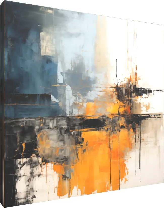
Kitchens, bathrooms and balconies: the moisture problem
This is a practical warning rather than a styling note. Canvas is a fabric stretched over a wooden frame, and sustained humidity is not kind to either. In a bathroom, an unventilated kitchen, or a covered balcony during the monsoon, a stretched canvas can slacken on its frame over time.
If you want abstract art in a humid room, an acrylic print is the more durable choice — it is a hard, sealed surface rather than a fabric, and it wipes clean. In a kitchen that also gets cooking grease, that wipe-clean property matters more than the aesthetic argument. Keep any piece off a wall that gets direct water contact regardless of finish.
Stairwells and double-height walls
These walls are where abstract art outperforms every other category, and they are chronically under-used. A stairwell is viewed from multiple heights and angles as you move, which punishes anything with a single correct orientation — a portrait looks odd from below, a landscape photograph looks odd from above. Abstract work has no correct viewing angle, so it holds up from all of them.
Go large. A double-height wall will absorb a far bigger piece than you expect, and the most common error here is a piece sized for a normal room, which ends up looking marooned. Bold colour fields read better than fine detail, because you are often seeing the work from six or seven metres.
If you follow Vastu
Many Indian households weigh Vastu principles when placing art, and abstract work raises the question more often than figurative pieces do, because the imagery is open to interpretation. Broadly, the considerations people apply are around direction, colour association and subject matter — warm tones in the south and south-east, blues and water-associated imagery in the north and north-east, and a general preference for imagery read as harmonious rather than turbulent in bedrooms and prayer spaces.
How strictly you apply any of this is a personal matter, and the practical advice in this guide does not depend on it. If it is a factor for you, our post on Vastu tips for printed products goes through placement by room and product type in more detail.
Renting, and walls you cannot drill
Worth planning for before you buy, because it affects which size and finish make sense.
- Lean, do not hang. A medium canvas resting on a console, a shelf or a mantel needs no fixings at all, and leaning is a legitimate styling choice rather than a compromise.
- Weight decides your options. Canvas is light; acrylic is considerably heavier for the same dimensions. If you are relying on adhesive hooks, a gallery wrap is the realistic choice and a large acrylic is not.
- One large piece means one hole. If you are minimising wall damage, an anchor piece is better than a gallery wall of six frames — both visually and in terms of what you have to fill when you leave.

Lighting, which matters more than the room
Almost every guide to wall art stops at which wall. But a well-chosen abstract on a badly lit wall looks worse than an ordinary one on a well-lit wall, and lighting is the cheapest change you can make after the fact. It is particularly consequential for abstract work, because colour saturation and surface texture are the whole proposition — and both depend entirely on how light hits them.
Angle beats brightness
The standard guidance is to light a piece at roughly 30 degrees from vertical. Shallower than that and the light bounces straight back at the viewer, which on an acrylic print means glare and on a canvas means a washed-out flat look. Steeper and you get a hard shadow from the frame edge across the top of the image — and on a floater frame, where there is a deliberate gap, that shadow is especially obvious.
This is also the argument against a ceiling downlight sitting directly above a piece, which is a very common arrangement in Indian apartments. A downlight at 90 degrees grazes the surface, exaggerates every imperfection in the wall behind, and lights the top third of the artwork far more brightly than the bottom. If you have one, angling it or moving the piece a little off-centre from it usually helps more than adding brightness.
Match the bulb temperature to the palette
- Warm white light deepens reds, ochres, golds and terracotta, and is the right choice for the warm-palette pieces that suit living and dining rooms. It will, however, dull a cool blue and can turn a crisp white to cream.
- Neutral or cool white keeps blues and greens accurate and preserves whites. It suits the calm blue-dominant work that belongs in bedrooms, and geometric pieces in an office.
- Mixing them in one room is the real mistake. A warm ceiling bulb and a cool lamp near the same wall will make the artwork look different depending on which is on, and neither version will be what you chose.
Natural light cuts both ways
Daylight is the most flattering light abstract work will ever get, and also the most damaging. Direct, sustained sunlight will fade any print over years, and strong side light across a canvas exaggerates the weave in a way that is not always desirable. A wall that gets bright indirect daylight is close to ideal; a wall that gets two hours of direct afternoon sun is a wall to keep art off, regardless of finish.
If the wall you want to use genuinely has no light and no easy way to add any — a windowless corridor, a dim landing — the honest answer is that no abstract print will solve it. That is the situation a backlit piece is designed for, since it supplies its own light rather than depending on the room; our guide to LED photo frames covers how that works and what it costs to run.
Quick reference
| Room | Choose | Avoid |
|---|---|---|
| Living room | Large, warm, high-impact; floater frame or gallery wrap | Undersizing; busy work in an already-busy room |
| Bedroom | Soft washes, blues and pastels, low contrast | High contrast, hard geometry, outward-facing faces |
| Home office | Geometric, restrained, mid-sized | Gloss behind a desk; fine detail on camera |
| Entryway / hallway | Portrait orientation, smaller, premium finish | Dark low-contrast work in a dim corridor |
| Dining room | Warm ochre and terracotta; hung lower | Cool blue-white palettes; hanging too high |
| Kitchen / bathroom | Acrylic, for durability and wipe-clean | Stretched canvas in sustained humidity |
| Stairwell | Very large, bold colour fields | Fine detail; sizing it like a normal room |
The short version
Buy big and warm for the living room, soft and low-contrast for the bedroom, structured and matte for the office, tall and well-finished for the hallway. Keep gloss away from windows, monitors and anything that reflects, and keep stretched canvas out of genuinely humid rooms. If you have a stairwell or a double-height wall sitting empty, that is the best abstract-art opportunity in your home and almost certainly the one you have been ignoring.
There are 44 abstract pieces in the collection, each available as a gallery wrap, acrylic print, floater frame or photo frame, from around ₹581, with free delivery across India above ₹300. You can filter by room, mood and colour and preview any piece on a wall in the abstract painting gallery.