






Abstract art is the easiest wall art to buy and one of the easiest to get wrong. Easy, because there is no subject to clash with anything — no family you have to explain, no landscape that belongs to a place you have never been, no portrait staring at your guests. Wrong, because that same freedom removes the obvious test. With a photograph you know whether it is the right photograph. With an abstract, people buy the piece they liked on screen and discover it argues with the sofa.
There is a method that avoids this, and it has almost nothing to do with taste. This guide covers it: why abstract works on walls where other art struggles, how to choose by colour rather than by image, how to size a piece properly, and — the part most buying guides skip — which of the four print finishes actually suits which kind of abstract painting. The gallery currently holds 44 abstract pieces with prices from around ₹581, so the question is rarely whether something will appeal. It is which one belongs on your wall.
Why abstract art suits walls that other art does not
It is worth understanding what abstract art is actually doing in a room, because it explains where it belongs and where it does not.
- It carries colour without carrying content. An abstract piece can introduce a deep blue or a warm ochre into a room without introducing a story. That makes it the most flexible tool for pulling a colour scheme together.
- It reads from a distance. Shapes and colour fields are legible across a room; fine detail is not. This is why abstracts work on large living-room walls and in stairwells, where a detailed piece would simply be a smudge from the sofa.
- It dates slowly. A photograph is pinned to the year it was taken and the people in it. A field of colour and texture is not. Abstract work tends to survive a change of furniture better than almost any other category.
- It does not compete for meaning. In a dining room or an office, a piece that demands interpretation can be tiring. Abstract work can sit in the background and still improve the room, which is a genuinely useful property.
The flip side: abstract art gives you no help with scale or colour. A portrait tells you roughly how big it should be, because faces have an expected size. An abstract will happily be printed at any dimension and look wrong at most of them. So the discipline has to come from you.
Choose by colour, not by picture
This is the single most useful change you can make to how you shop for abstract art, and it is counter-intuitive, because the instinct is to browse until something strikes you.
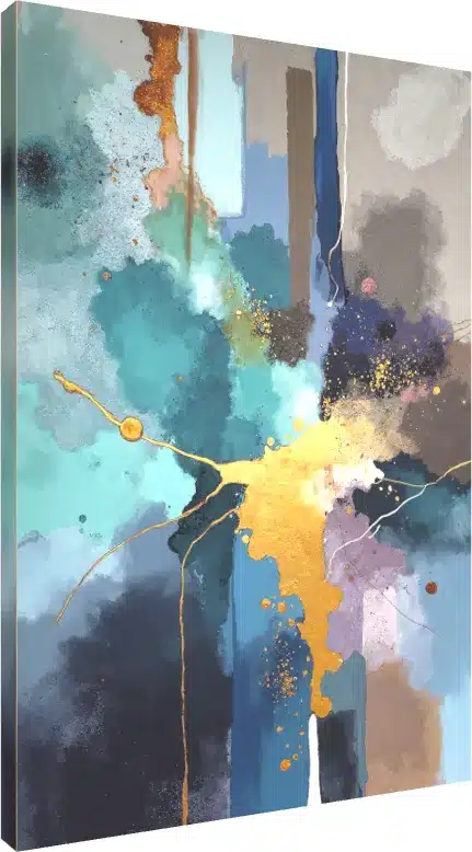
Instead, start in the room. Stand where people sit and write down the two or three colours already doing the most work — not the wall paint, which is usually neutral, but the fabrics and wood: the sofa upholstery, the curtains, a rug, the tone of the furniture. Then shop for a piece that contains at least one of those colours somewhere in it. The gallery has colour filters, including Blue and Gold, which makes this quick.
The reason this works is that it changes the question from “do I like this painting?” to “does this painting belong in this room?” — and those have different answers more often than people expect. A piece can be genuinely beautiful and still be the wrong object for the wall you have.
Repeat one colour, contrast the rest
You do not want a painting that matches the room — matching reads as a showroom, and it flattens everything. You want one shared colour so the piece looks deliberate, and some genuine contrast so it does not disappear. A blue and yellow abstract above a grey-blue sofa works because the blue ties it in and the yellow earns it attention. The same abstract above a blue-and-yellow patterned sofa is chaos.
If you want to go further into palette thinking, our piece on matching prints to current colour trends covers how colour families behave in print.
The four print finishes, and which abstracts suit each
Every piece in the gallery can be ordered as a gallery wrap, an acrylic print, a floater frame or a photo frame. This choice changes the finished object more than most people realise — the same painting in two different finishes can look like two different price brackets. And crucially, the right finish depends on the kind of abstract you have chosen.
| Finish | What it looks like | Best for |
|---|---|---|
| Gallery wrap | Canvas stretched over a frame, image continuing round the edges, no glass. Matte and textured. | Textured brushwork, painterly and watercolour abstracts. The weave reinforces the painted look. |
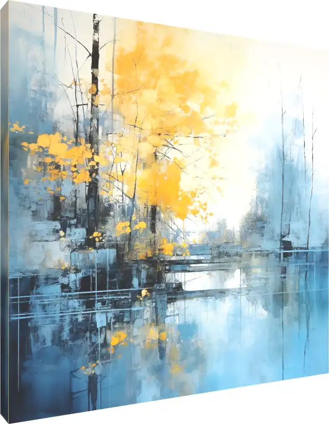
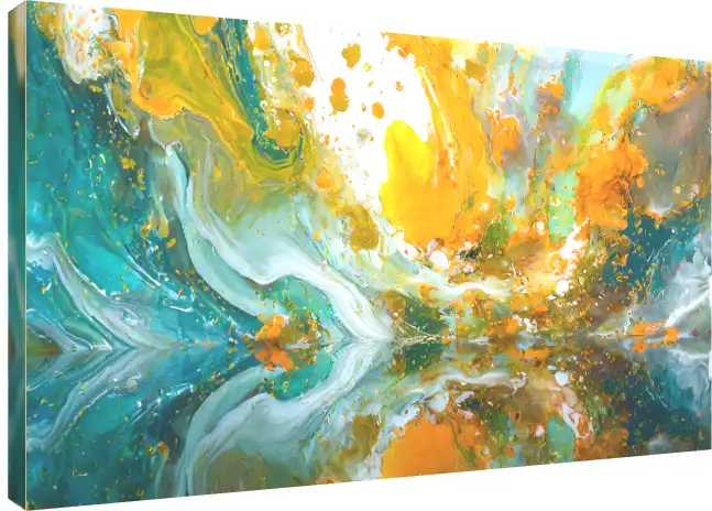
| Acrylic | Glossy, hard, light-catching, with visible depth in the surface. | Fluid pours, liquid colour splashes, high-contrast and metallic work. Gloss amplifies saturation. |
| Floater frame | Canvas set inside a frame with a deliberate gap, so the art appears to float. | Pieces you want to read as a collected artwork rather than a print. The most gallery-like option. |
| Photo frame | Conventional framed print behind a face. | Smaller sizes, groupings, and rooms where a traditional frame suits the furniture. |
The canvas options are printed on 400 GSM canvas using giclée printing, which matters for abstract work specifically: broad areas of flat colour and soft gradients are exactly what reveals poor printing. Banding in a sky-blue wash or a muddy transition in an ochre field is far more visible than it would be in a busy photograph.
The texture question, in one rule
If the painting’s appeal is the surface — visible brushstrokes, impasto, peeling or cracked texture — choose canvas. The canvas weave adds physical texture that agrees with what the image is doing, and a matte surface lets you see it.
If the painting’s appeal is the colour — fluid pours, liquid splashes, deep saturated blues, gold — choose acrylic. Gloss deepens colour and adds a sense of depth that canvas cannot reproduce. A liquid-art piece on matte canvas loses the wet quality that made it worth looking at.
One practical caveat on acrylic: it is glossy, so it reflects. On a wall facing a window or a bright light, you will see the room in it at certain times of day. Canvas has effectively no glare, which is why it is the safer choice for a bright room. If you are weighing the floater option specifically, our guide to canvas floater frames covers the construction in detail.
Getting the size right
Each artwork is offered in Small, Medium and Large, and you can see it on a wall using the 3D preview before ordering. Check the exact dimensions on the product page for the size you select, then test them against the rules below rather than guessing from the thumbnail — a piece always looks larger in a preview than it does on a real wall.
- Above a sofa or a bed: aim for roughly two-thirds the width of the furniture. This single rule prevents the most common mistake in the category, which is a piece that is too small and ends up looking like a postage stamp on a large wall.
- Centre at eye level. The middle of the artwork should sit around 145–150 cm from the floor. Most people hang art too high, usually because they centre it on the wall rather than on the viewer.
- Leave a hand’s width above furniture. Roughly 15–20 cm between the top of the sofa back and the bottom of the frame. Any more and the two stop reading as a group.
- Go bigger in a big room. Abstract work has no inherent scale, so a large piece does not look pretentious the way an oversized portrait would. If you are between two sizes in a living room, take the larger.
If you are planning several pieces rather than one, spacing and centre height start to matter more than individual size, and the arithmetic changes. Our step-by-step guide to planning a gallery wall covers the measuring method and the fixings that actually hold in Indian concrete and brick.
Using the mood filters as a shortcut
The gallery can be filtered by mood and room — Calming, Romantic, Minimal, Luxury, Office Decor and others — alongside the colour filters. These are more useful than they first appear, because they encode the thing that is hard to judge from a thumbnail: how a piece will feel to live with.
A good way to use them is to filter by the mood you want the room to have rather than the mood of the painting you think you want. A bedroom you want to feel calm is better served by filtering Calming and choosing from what comes back than by browsing everything and talking yourself into a high-contrast piece because it looked striking on a white background.
What the price actually depends on
Listed prices in the abstract category currently start from around ₹581 to ₹800, but every listing shows a from price, which is the entry point rather than the final cost. Two things move it: the size you choose, and the finish. A small photo-framed print and a large floater-framed canvas of the same artwork sit in genuinely different brackets.
Worth knowing when you compare: free delivery across India applies above ₹300, so shipping is not usually a factor in the decision. If you are choosing between a larger size in a simpler finish and a smaller size in a premium finish for the same money, the larger piece almost always does more for a room. Scale beats finish on a wall you view from across the room; finish matters more at close range, in an entryway or beside a desk.
Pairs, diptychs and when one piece is enough
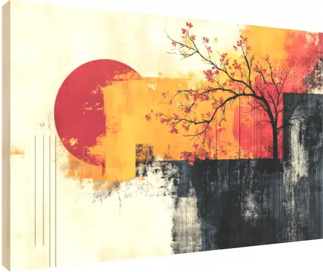
The catalogue includes diptych-style pieces designed to read as two panels, and buying two related abstracts to hang as a pair is a common approach for a wide wall. It works, with two conditions.
- Share a palette, not a subject. Two pieces from the same colour family hang together convincingly even if the imagery is unrelated. Two pieces with similar imagery but clashing palettes do not.
- Hang them close. Around 5–8 cm apart so they read as one object. Spaced far apart they become two separate decisions and the wall looks unresolved.
That said, one well-sized piece beats three hedged ones. If you are uncertain, buy the single larger abstract rather than assembling a group you are not confident about — a group needs a plan, and an anchor piece does not.
Mistakes worth avoiding
- Buying from the thumbnail. A 300-pixel preview flattens texture and exaggerates contrast. Use the full-screen and 3D previews before deciding.
- Matching the sofa exactly. One shared colour reads as intentional; a full match reads as a furniture showroom.
- Choosing acrylic for a window-facing wall. You will spend part of each day looking at a reflection of the window.
- Going one size down to save money. This is the most regretted decision in wall art. A smaller piece in a better finish is usually the worse trade.
- Hanging at wall centre instead of eye level. Art hung too high is the most common and most fixable error in Indian homes, where ceilings are often generous.
- Choosing a busy abstract for a busy room. If the room already has patterned upholstery, curtains and a rug, the wall is where the eye should rest.
The short version
Start in the room and note the two or three colours already present. Shop by colour filter rather than browsing until something catches your eye. Choose canvas if the painting’s appeal is its texture and acrylic if its appeal is its colour, and keep acrylic away from window-facing walls. Size to two-thirds of the furniture below it, centre it at eye level, and if you are between sizes, go up. Get those right and an abstract piece will outlast several changes of furniture — which is more than most things you buy for a wall.
There are currently 44 abstract pieces in the collection, each available as a gallery wrap, acrylic, floater frame or photo frame, with prices from around ₹581 and free delivery across India above ₹300. You can filter by colour and mood and preview any piece on a wall in the abstract painting gallery. For where each kind of piece belongs, see our companion guide to abstract art room by room.