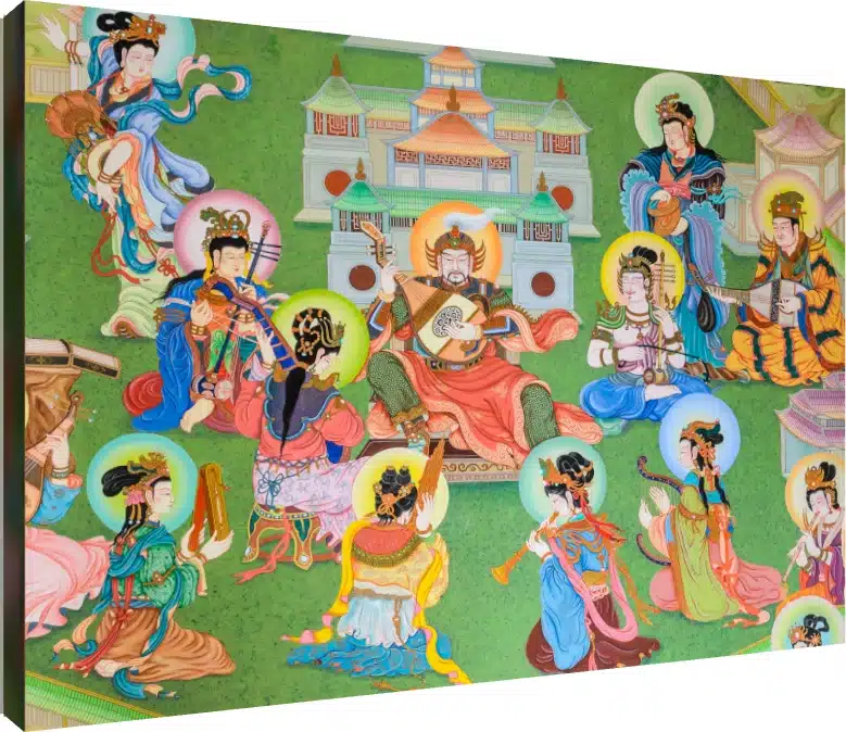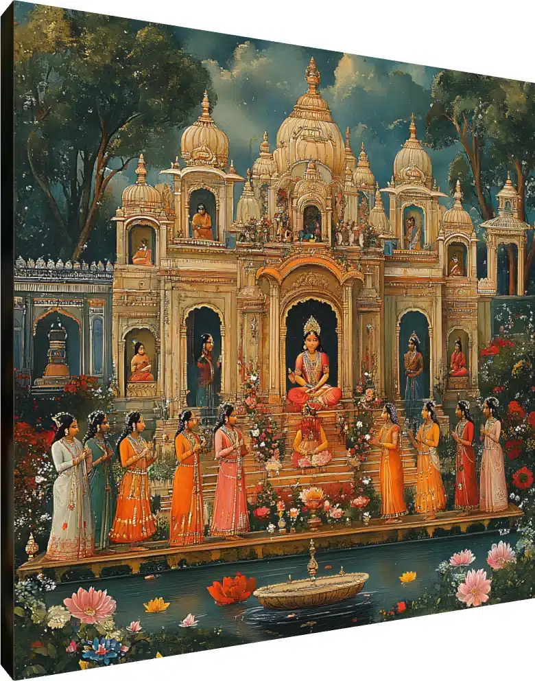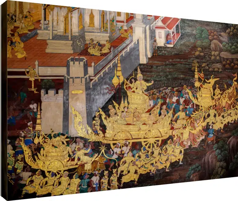
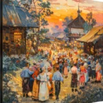
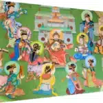
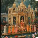
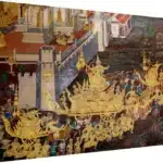



The village at festival time is one of the most painted subjects in Indian art, and it has been for far longer than the idea of a painting-for-a-wall has existed. The reason is straightforward: a festival is the moment when a village is most completely itself. Everyone is outdoors, in their best clothes, doing something together, usually to music. If you want to depict a community rather than a landscape or a person, this is the moment to choose.
What follows is what the genre is, which traditions feed it, the conventions that recur across all of them, and what a piece like this asks for on a wall.
The traditions this subject comes from
India does not have one folk painting tradition; it has dozens, each tied to a region, a community and often a ritual occasion. Several of them take communal village life as their central subject, and a contemporary village-festival scene draws on their shared visual habits even when it belongs to none of them specifically.
- Warli, from the Palghar and Thane region of Maharashtra, is the most direct ancestor of the festival scene. Painted traditionally in white rice paste on earth-coloured walls, it reduces human figures to two triangles and a circle, and its signature subject is the tarpa dance — a spiralling chain of dancers circling a musician. It is a tradition about collective motion rather than individual people.
- Madhubani, from the Mithila region of Bihar, fills every available surface with pattern and encloses compositions in double-line borders. Weddings and festivals are core subjects, and it was historically painted on the walls of homes for specific ceremonies.
- Gond, from Madhya Pradesh, builds its forms from dense fields of dots and dashes, giving flat shapes an internal shimmer.
- Pattachitra, from Odisha and Bengal, is cloth-scroll painting with strong outlines and a narrative sequence, made to be unrolled and recited from.
- Kalamkari, from Andhra Pradesh, works in pen and block on cotton, with earth and vegetable dyes.
Worth noting for readers in Maharashtra: Warli is a living local tradition, not a historical curiosity, and the festival-crowd composition is substantially its invention.
The conventions they share
These traditions developed separately and look nothing like each other, yet they handle a crowd in strikingly similar ways — and understanding how makes the paintings much easier to read.
- No vanishing point. There is no linear perspective. Space is organised by stacking or by registers, so figures higher in the frame are further away rather than smaller.
- Figures are types. Nobody in a village festival scene is a portrait. Figures are identified by what they are doing, what they carry and what they wear — drummer, water-carrier, dancer, bride — not by their face.
- Repetition is the point. A row of near-identical dancers is not a shortcut. Rhythm and repetition are how these paintings convey music and collective movement, which is a genuinely difficult thing to put in a still image.
- Space gets filled. Empty background is avoided. Gaps are occupied by foliage, animals, pattern or small secondary scenes, which is why these works reward close looking.
- The composition has no single hero. Attention is distributed across the scene. The subject is the gathering, so no one figure is allowed to dominate it.
Why sunset
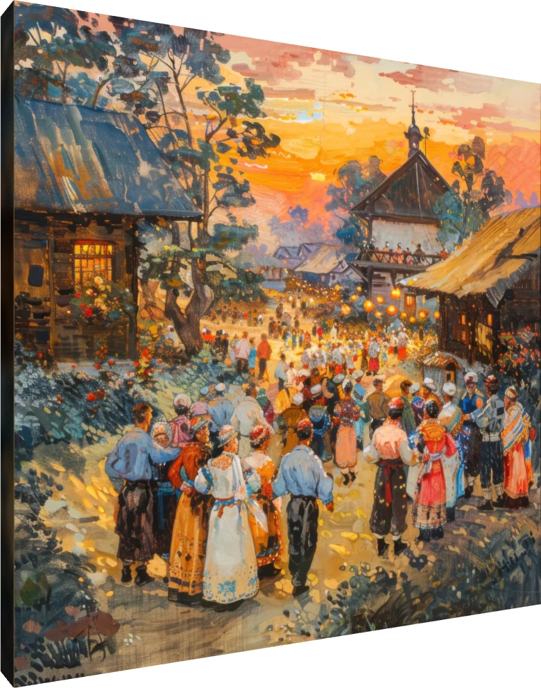
Setting a festival at sunset is a choice that solves several problems at once. Narratively, it is accurate — rural festivals and dances largely happen after the working day ends, so the golden hour is when a village actually gathers.
Formally, it does more. A low sun supplies a single warm light source that unifies a crowded composition, so dozens of separate figures read as one scene rather than a collection of parts. It licenses a warm, saturated palette — ochre, orange, red, violet — without the picture looking artificially coloured. And it gives the painter long shadows and strong silhouettes, which are useful for separating overlapping figures in a dense crowd. A midday version of the same scene would be flatter and harder to read.
Where this kind of piece belongs
Its defining characteristics as decor are that it is warm, busy, and distributed rather than focal. That points clearly to some rooms and away from others.
- Dining rooms. Probably the single best placement. The subject is communal eating, music and gathering, the warm palette flatters both food and faces under warm light, and a distributed composition does not demand attention while people are talking.
- Kitchens and breakfast areas. Same logic, and the palette suits wood, terracotta and brass.
- Hallways and stairwells. A composition meant to be read along its length belongs on a wall you move past.
- Children’s rooms and family spaces. There is a lot to find in a crowd scene, which makes it one of the few genuinely re-lookable subjects for a child.
- Less suited to bedrooms. Warm, saturated and busy is the opposite of what a bedroom wall should be doing.
- Less suited as a living-room anchor. No focal point means nothing for the furniture to arrange itself around. Better on a long wall than above a sofa.
Pairing, size and finish
A warm, high-chroma piece needs a calm setting. Plain walls in white, warm grey, cream or a muted green will carry it; patterned wallpaper beside it will not. Give it one material echo in the room — wood, cane, terracotta, brass — and resist adding three.
Buy it larger rather than smaller. A crowd scene printed small becomes a texture: you lose the individual figures that are the entire pleasure of the genre. If the choice is between a large gallery wrap and a small floater-framed print, take the size.
On finish, canvas is the sympathetic choice. A gallery wrap’s matte, woven surface is close to the painted cloth and wall surfaces these traditions actually used, and it suppresses glare, which matters for a busy image where reflections would obscure detail. Acrylic will push the saturation higher and add gloss — effective in a dim dining room, but it reads as more contemporary than the subject is, and in a kitchen you would be choosing it for its wipe-clean durability rather than its look.
One lighting note: this palette is already warm, so a warm bulb can tip it into an undifferentiated orange. A neutral white light keeps the reds, ochres and violets distinct from one another. This is the one traditional subject where warm lighting is not automatically the right answer.
The short version
The village festival scene is a genre, descended most directly from Warli in Maharashtra and sharing its conventions with Madhubani, Gond, Pattachitra and Kalamkari: no perspective, figures as types, repetition standing in for music, filled space, and no single hero. Sunset is chosen because it is when villages actually gather and because one warm light source unifies a crowd. On a wall it wants a dining room or a long passage rather than a bedroom or a sofa-anchor position, a plain setting, a generous size, a matte canvas finish and neutral rather than warm light.
This piece is available from around ₹581 as a gallery wrap, acrylic print, floater frame or photo frame, in Small, Medium and Large, with free delivery across India above ₹300. You can preview it on a wall before ordering in the gallery collection.