
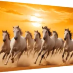
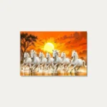

Anyone shopping for a seven-horse painting runs into the same problem. You have already decided you want one. What you then face is twenty-seven versions of broadly the same image — seven horses, mid-gallop, in various weather — at prices within a couple of hundred rupees of each other. The symbolism is identical across all of them. So on what basis do you actually choose?
This guide answers that. It is not about what the seven horses mean or where Vastu says to hang them — our post on the Vastu meaning and placement of the 7 horse canvas print covers that ground. This is purely about picking the right one of the twenty-seven for your particular wall, in four decisions.
First, one thing worth saying plainly
No variant is more auspicious than another. The tradition attaches meaning to the horses, to their number and to the direction of their movement — not to whether they are running through a desert or along a beach. Nothing in Vastu Shastra ranks sunsets above waterfalls.
That is liberating rather than disappointing, because it means you can choose entirely on how the piece will look in your room, without worrying that you are picking the wrong one. Treat the decision as an interior-design decision. It is one.
Decision 1: orientation, which eliminates most options immediately
Start here, because it is the only decision governed by your wall rather than your taste, and it cuts the field roughly in half in one step. The collection includes both landscape and portrait compositions, and several listings name their proportions — 20×30, 27×36, 30×40, 20×37, 30×45.
- Landscape suits the wall above a sofa, a bed or a reception desk; a long corridor wall; the space above a sideboard or a credenza. Running horses are moving horizontally, so a landscape frame gives the movement room to read — this is the more natural format for the subject.
- Portrait suits a narrow wall, the gap between two windows or doors, the space beside a cabin door, a stairwell, or a pillar face. Portrait compositions stack the horses more densely, which reads as power rather than speed.
One practical check before you go further: measure the usable wall. The standard guidance is to size artwork at roughly two-thirds the width of the furniture beneath it. If that calculation gives you a width considerably greater than its height, you need a landscape piece and can ignore every portrait option, whatever it looks like.
Decision 2: the background, which is what you are really choosing between
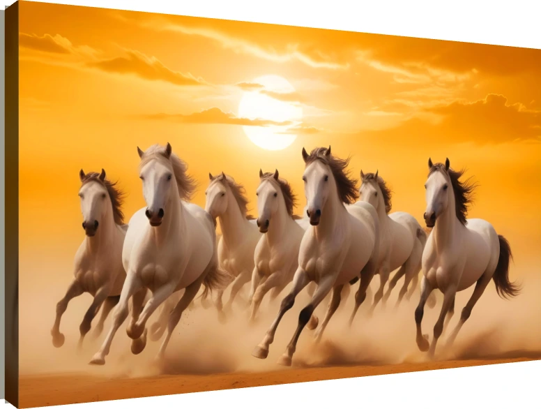
This is the genuine differentiator, because the background determines the palette the piece brings into your room. The horses are broadly similar across the collection; the setting is not.
| Background | Palette it brings | Works best with |
|---|---|---|
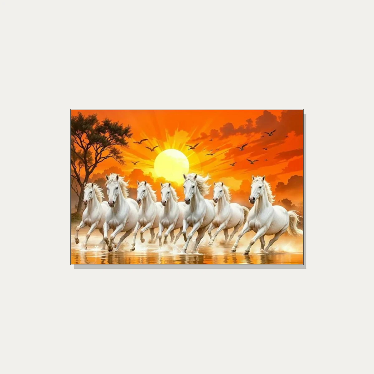
| Sunrise | Warm gold, amber, soft orange | The default choice. Suits wood furniture, beige and cream rooms, and offices wanting a warm rather than cold tone. |
| Sunset | Deeper orange, red, violet | Richer and more dramatic than sunrise. Good against dark or saturated walls; can overwhelm a pale minimal room. |
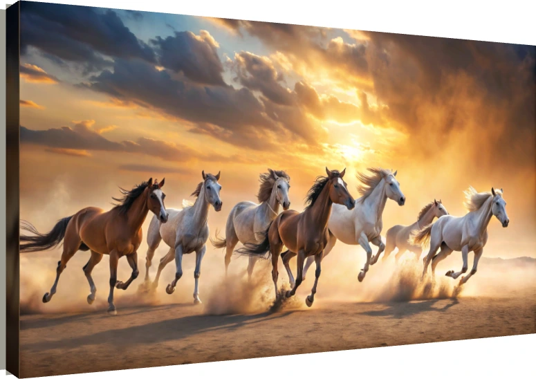
| Desert / sandstorm | Ochre, dust, muted brown | The most neutral option. Excellent where you want the subject without a strong colour commitment — rented flats, offices with existing brand colours. |
| Ocean / beach | Blue, white, cool highlights | The only genuinely cool-toned choice. Suits blue-grey interiors and rooms where warm art would clash. |
| Waterfall | Green, white, cool mist | Brings a landscape feel. Works in rooms with plants and natural materials. |
| Ice / winter | White, pale blue, grey | The most minimal and modern. Strong in a white or grey contemporary interior. |
| Forest | Green, brown, dappled light | Softest reading of the subject; least “corporate”. |
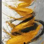
| Abstract / golden light | Gold, dark ground, high contrast | Reads as decor rather than as a landscape. Good for formal spaces and reception areas. |
The shortcut: identify the two or three colours already doing the work in your room — the upholstery, the curtains, the wood tone, not the wall paint — and choose a background that shares at least one of them. A warm room takes sunrise or desert. A cool, grey-blue room takes ocean or ice. A green-and-timber room takes forest or waterfall.
Decision 3: white horses or dark
Most of the collection shows white horses, and there is a practical reason beyond preference: white against a mid-tone background gives the highest internal contrast, which is what lets the piece read clearly from across a room. If the painting is going on a large living-room or reception wall viewed from four or five metres, white horses are the safer bet.
- White horses: maximum contrast and legibility at distance. The conventional choice, and the one most people picture when they picture this subject.
- Dark or mixed-colour horses: lower contrast, warmer, less assertive. Better in a smaller room or a space viewed from close range, where high contrast would feel aggressive.
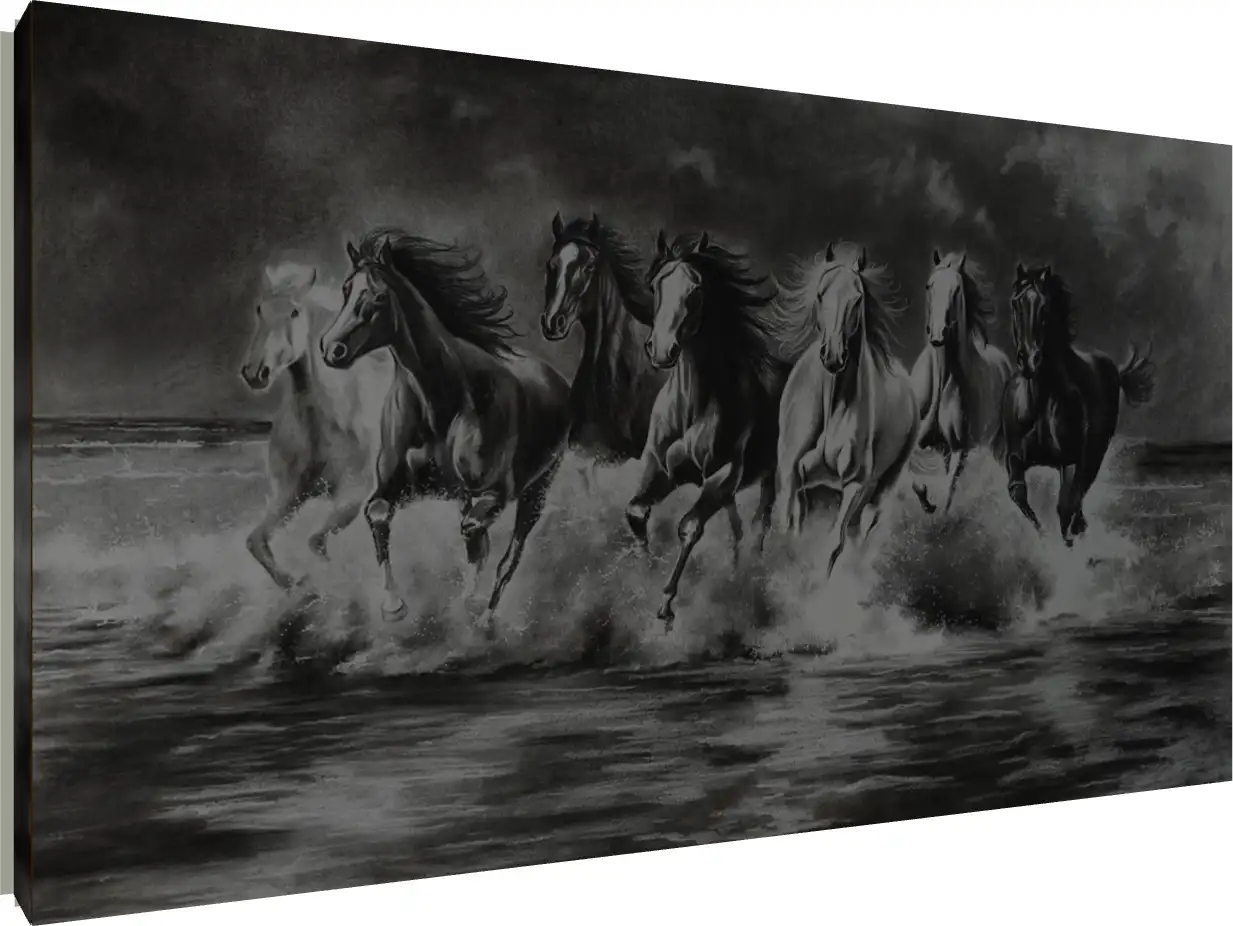
- Charcoal or monochrome treatments: the most useful option that most buyers overlook. A grey-scale rendering carries the full symbolism while introducing no colour at all — which makes it the obvious answer for a modern office with established brand colours, a minimal interior, or any room where another warm palette would clash.
Decision 4: how realistic you want it
The collection spans several levels of stylisation, and this is largely a question of what else is on your walls.
- Photographic realism — horses rendered as if photographed. Reads as a nature image. Fits homes with photographic art elsewhere; can look slightly literal in a traditional interior.
- Painterly — visible brushwork and painted texture. The most versatile register, and the closest to what people expect from “a painting”.
- Stylised or graphic — simplified shapes, flattened colour. Suits contemporary interiors and reads as deliberate design rather than decoration.
- Abstract — the horses implied rather than fully described. The choice if you want the symbol without a literal animal picture, and the easiest to live with over years.
If your home leans traditional, painterly is the safe answer. If it leans modern, stylised or abstract will sit better than realism — a photograph-like herd can feel out of place in a minimal room in a way that a graphic treatment does not.
Then the finish
Every piece can be ordered as a gallery wrap, an acrylic print, a floater frame or a photo frame. For this subject the choice splits fairly cleanly between home and workplace.
- Gallery wrap — canvas, matte, image continuing round the edges. The most painting-like and the most forgiving: no glare, which matters because this subject often goes on a bright feature wall. The default for a home.
- Acrylic — glossy and hard. Deepens the sunrise and sunset palettes considerably and adds a sense of depth to water and dust. It also wipes clean and reads as contemporary, which is why it suits offices, receptions and shops. The caveat is glare: avoid it on a wall facing a window or directly opposite a light.
- Floater frame — canvas set inside a frame with a deliberate gap. The most formal presentation, and the right call for a boardroom, a cabin or a formal living room.
- Photo frame — conventional framing. Best at the smaller sizes and in rooms where the other furniture is traditionally framed.
One point specific to a running-horse subject: motion benefits from gloss. Acrylic gives dust, spray and backlit manes a liveliness that matte canvas flattens slightly. If the piece is going somewhere without a window opposite, it is worth the upgrade for this subject more than for a calm one.
Home and office pull in different directions
Worth separating, because the same four decisions resolve differently.
- For a home: landscape, sunrise or desert, white horses, painterly, gallery wrap. Warm, legible, and easy to live with.
- For an office cabin or reception: landscape, charcoal or abstract gold, acrylic or floater frame. Carries the symbolism without importing a warm domestic palette into a professional space, and the harder finish survives a commercial environment.
- For a shop or showroom: the largest size the wall takes, high contrast, acrylic. It needs to read from the doorway.
- For a home office: smaller than you would choose for a living room, and matte rather than glossy — a gloss finish behind or beside a desk will catch your monitor.
On price, and the one oddity in the category
Listed “from” prices across the collection currently run between ₹663 and ₹937, with most sitting at ₹691. That is the entry point rather than the final cost — the size you choose and the finish both move it, and a large floater-framed canvas and a small photo-framed print of the same artwork sit in genuinely different brackets. Free delivery applies across India above ₹300.
One thing to be aware of while browsing: the collection also includes a two-horse composition alongside the sevens. If the number is the reason you are buying — and for most people choosing this subject, it is — check the image rather than relying on the category, and count.
The four-step shortlist
- Measure the wall and decide landscape or portrait. This removes about half the options.
- Name two colours already in the room and pick a background that shares one.
- Choose white for a big room, charcoal for an office, dark or mixed for a small warm space.
- Choose the finish by where it hangs: canvas at home and anywhere facing a window, acrylic for offices and dim walls, floater frame where it needs to look formal.
Work through those in order and twenty-seven options become two or three, at which point you can simply pick the one you like. Since no variant carries more significance than another, that final step genuinely is just preference.
The full collection is available as gallery wraps, acrylic prints, floater frames and photo frames in Small, Medium and Large, with free delivery across India above ₹300. You can preview any piece on a wall before ordering in the seven running horses collection. For what the symbol means and where the tradition says to place it, see our guide to the Vastu meaning and placement of the 7 horse canvas print.